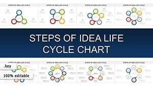
Period charts in Keynote capture the rhythm of time through cycles and sequences, leveraging the app`s cinematic transitions for fluid storytelling. Perfect for recurring processes or linear histories, they make temporal data dance across your slides.
For Mac-savvy presenters in tech, arts, or academia, these templates blend simplicity with sophistication, editable in moments to fit your vision. They turn chronological chaos into harmonious visuals that linger in minds.
From orbital cycles to phased arcs, our offerings amplify Keynote`s strengths. Delve in and orchestrate time in your presentations masterfully.
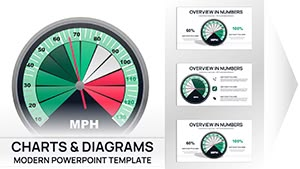
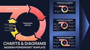
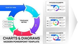
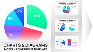
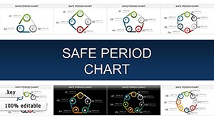
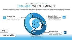
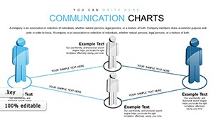
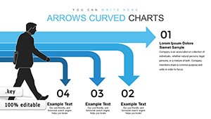
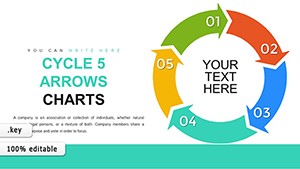
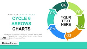
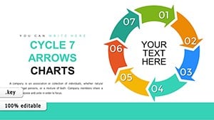
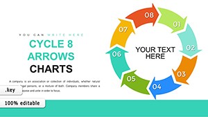
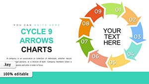
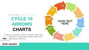
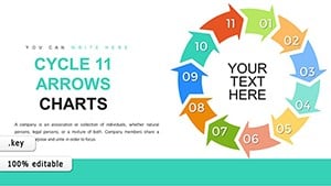
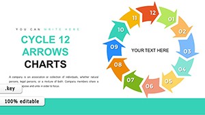
12-Step Cycle Arrows Keynote Charts: Streamline Your Process Narratives
ID: #KC00772
$20.00
Crafting Compelling Period Narratives in Keynote
Keynote period charts exploit the tool`s object builds to unfold eras smoothly, with orbital animations for cycles that evoke continuity. This immersive approach outshines flat alternatives, fostering a sense of progression that aligns with your discourse.
Enhanced with bezier curves and particle effects, our templates add whimsy to structure, differentiating from prosaic defaults.
Versatile Scenarios for Period Charts
Innovation Hubs: Cycle through R&D phases, illustrating iterative advancements.
Artistic Projects: Timeline creative inspirations over seasons, connecting dots artistically.
Policy Briefings: Sequence regulatory changes across terms, clarifying evolutions.
Such contexts affirm period charts` narrative prowess in Keynote.
Advanced Tactics for Keynote Periods
Synchronize chart motions with slide advances using timing controls, and employ masks for focal highlights on pivotal periods. Curate icon libraries for era-specific flair, and preview in full-screen for transition polish. Collaborate via iCloud for collective refinements.
Voiceover scripting pairs naturally with phased reveals for hybrid formats.
Trailblazing Concepts to Explore
Narrate seasonal marketing cycles in brand strategies, looping visuals for emphasis. In wellness coaching, chart habit formation over months with motivational arcs. Templates ignite these ideas, harmonizing time with theme.
Non-linear period maps suit branching histories innovatively.
Timeless Tools for Modern Storytellers
Retina-ready and animation-preserved on export, these charts suit any canvas. Preset durations auto-adjust for varying scopes, streamlining prep.
Weave your timeline - choose from our period charts and keynote the future.