Percentages PowerPoint Charts
Command attention with bold percentage chart templates engineered for PowerPoint. These robust visuals amplify stats in sales decks, dashboards, and briefings with unyielding clarity.
For analysts, leaders, and communicators, they pack punch through vivid colors and kinetic reveals. Transform data into declarations.
From explosive pies to sturdy meters - boldness baked in.
Impact your audience? Command our PowerPoint percentage charts.
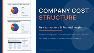
PowerPoint Pie Chart Cost Structure - Editable PPTX
ID: #PC01122
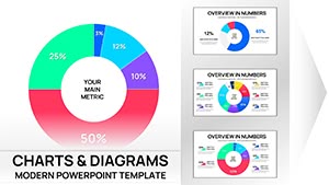
PowerPoint Chart Doughnut Template - Editable PPTX | ImagineLayout
ID: #PC01101
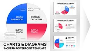
Comprehensive Pie Charts PPT Template Collection
ID: #PC01100
Pie Charts PowerPoint Template - 26 Editable Slides
ID: #PC01094
PowerPoint Pie Charts Template
ID: #PC01070
Presentations with AI-Powered Robot PowerPoint Charts
ID: #PC01054
Law PowerPoint Charts for Professional Excellence
ID: #PC01031
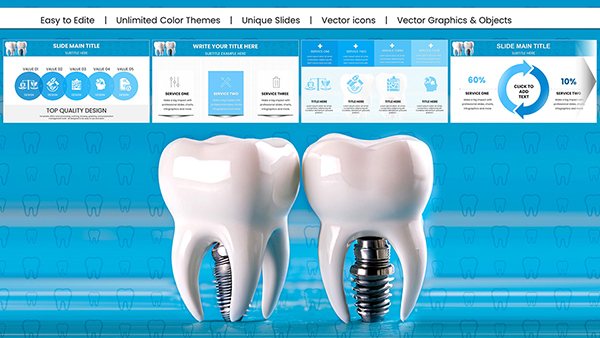
Dental Implant PowerPoint Charts: Precision for Medical Pros
ID: #PC01025
Robot Artificial Intelligence PowerPoint Charts Presentation: Revolutionize Your Tech Narratives
ID: #PC01020
Analytical Reports PowerPoint Presentation Template: Elevate Your Data Storytelling
ID: #PC01017
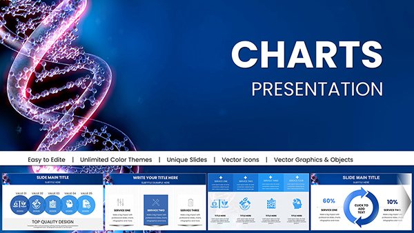
Stunning DNA Genome PowerPoint Charts Presentation: Bring Genetics to Life
ID: #PC01016
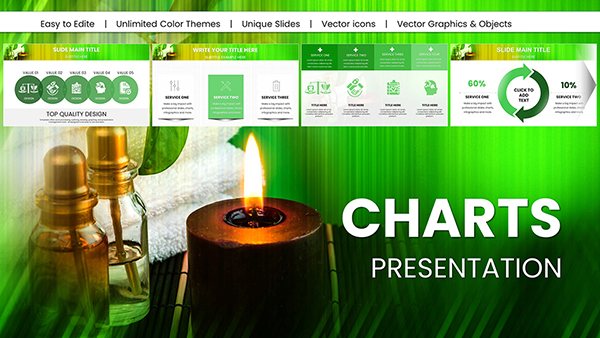
Professional Spa Procedures PowerPoint Charts Template: Optimize Your Wellness Business
ID: #PC01015
Spa Treatments PowerPoint Charts Presentation
ID: #PC01011
SPA Foot Treatment PowerPoint Charts Template
ID: #PC01010
DIY Face Mask Spa PowerPoint Charts: Transform Wellness Presentations
ID: #PC01005
Drone Commercial PowerPoint Charts - 59 Editable Slides for Industry Pros
ID: #PC00998
Design Ambulance PowerPoint Charts: Empower Medical Communications
ID: #PC00975
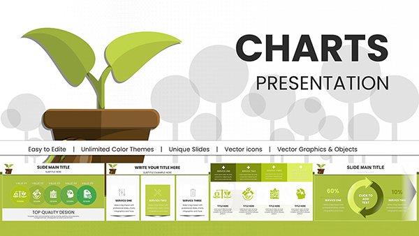
Building a Greener Tomorrow: Eco-Friendly Growth with Sustainable Future PowerPoint Charts
ID: #PC00967
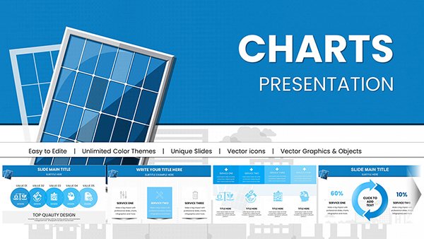
Solar Energy PowerPoint Charts: Renewable Data Visualization
ID: #PC00966
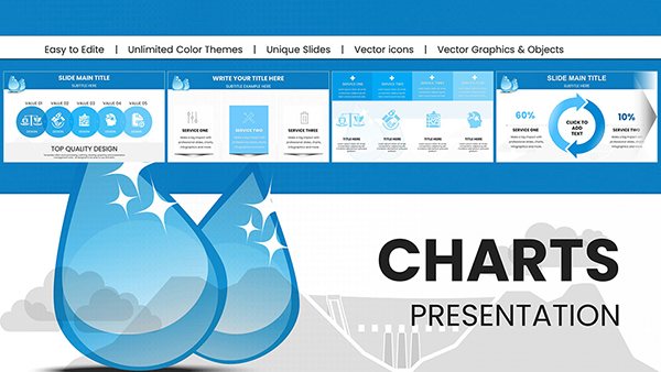
Unleashing the Flow: Hydropower Energy PowerPoint Charts for Dynamic Presentations
ID: #PC00965
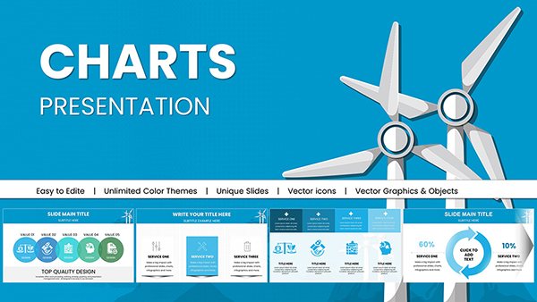
Powerful Wind Energy PowerPoint Charts: Elevate Your Renewable Presentations
ID: #PC00964
Medicine: Personal Protective Equipment (PPE) PowerPoint Charts Template
ID: #PC00878
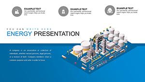
Energy Sector PowerPoint Charts Template Excellence
ID: #PC00750
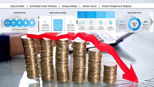
Sales Analysis PowerPoint Charts Template: Unlock Data Insights
ID: #PC00695
Boldness in Percentage Charts for PowerPoint Charts assert presence, using PowerPoint`s zoom effects for dramatic emphasis. Indispensable for high-stakes shares.
Leaders spotlight growth, analysts dissect trends - forceful tool.
High-Impact Scenarios Board Meetings: Explosive rings for quarterly leaps.Trend Analyses: Stacked visuals for market shifts.Performance Briefs: Gauges for target hits. Bolder than standards, with explosive scalability. Counsel: Bold fonts for labels.
Amplifying Chart Boldness Fuse with media for multimedia blasts or entrance zooms for reveals. Boldly, theme sports for motivation metrics.
Robust for projectors. Pros laud the batch edits.
Bold Build Process Slot into presentation. Charge with figures. Infuse dramatic pans. Bolden contrasts. Blast through tests. Potent promptly. Dare dashed lines for accents.
Intensifying Influence Bold charts ignite 80% stronger responses. Embed calls-to-action mid-slide.
High-vis for varied venues.
Declare your data - seize PowerPoint charts today.
Frequently Asked Questions Wield these for commanding presence. Boldness beckons.