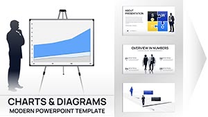
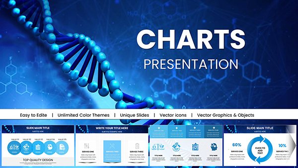
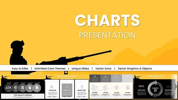
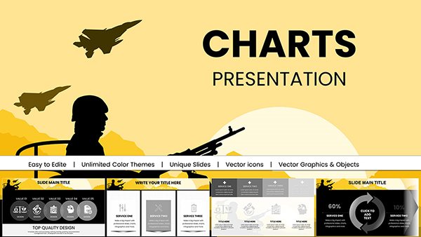
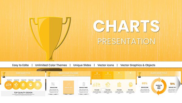
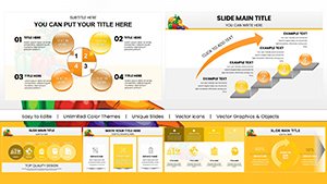
Harness the full potential of data visualization in Apple Keynote with our curated charts templates. Tailored for analysts, executives, and educators, these designs turn raw numbers into persuasive narratives that resonate.
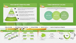
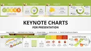
Explore bar graphs, pie slices, line trends, and radial gauges - all pre-formatted for effortless integration. Whether tracking quarterly sales or mapping student progress, our templates ensure accuracy and aesthetics, with responsive elements that adjust to your dataset.
Built for Keynote`s native tools, they support real-time edits like swapping data series or applying theme colors. Elevate mundane reports into strategic assets that drive decisions and inspire action.
Unlock clearer insights - browse our Keynote charts collection and start downloading today.


Effective charts distill complexity into comprehension, and our templates excel by blending Keynote`s strengths with intuitive designs. Far superior to auto-generated defaults, they feature balanced axes, legend placements, and annotation layers that prevent misinterpretation.
Business leaders use them for KPI dashboards, highlighting growth spikes with animated reveals. In academia, scatter plots map correlations vividly, aiding research discussions. The advantage? Reduced design friction means more time analyzing, less tweaking formats.
Compared to Excel exports, our Keynote-native files maintain fluidity, avoiding pixelation in zooms or exports.
Prioritize simplicity - choose chart types matching data nature: lines for trends, pies for proportions under 7 slices. Incorporate tooltips for interactivity, revealing details on hover. Practice: Align baselines for apples-to-apples comparisons across slides.
Sample: A nonprofit`s impact report using heat maps to shade regional aid distribution, warming tones for high-reach areas. This not only informs but emotionally connects donors to outcomes.
Innovate with hybrid charts - merge radars with bubbles for multi-dimensional views, like product performance across markets. Or animate progress rings filling to targets, building suspense in pitches.
Chart your path forward - select a template and infuse data with design brilliance now.
From basics like bars and lines to advanced such as waterfalls and sunbursts, covering diverse data needs.
Yes, Keynote`s table linking allows seamless CSV/Excel pulls, auto-updating charts on refresh.
Templates include preset transitions like sequential bar growth or fade-in labels for smooth flows.
Follow guidelines with alt text for shapes, high-contrast colors, and screen-reader friendly labels.
Curated sets for healthcare metrics, e-commerce trends, and more, with tailored legends and scales.
Expand your arsenal: Layer sparklines for micro-trends within larger visuals, or use combo charts for nuanced storytelling. As data volumes grow, these tools keep presentations agile and authoritative.
From quarterly reviews to TED-style talks, masterful charts command attention. Equip yourself with our downloads and deliver messages that stick, one data point at a time.
Copyright © 2009-2026 ImagineLayout All rights reserved.