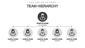
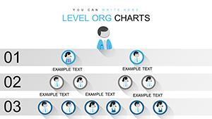
Illustrate your company`s framework with our PowerPoint organizational chart templates, engineered for straightforward hierarchy depiction. From top executives to entry roles, these visuals foster understanding and alignment.
Geared toward administrators, consultants, and planners, they offer drag-and-drop edits to incorporate names, titles, and connections precisely. Boost your reports and meetings with structured insights that resonate.
Scan our assortment for tailored formats. Infuse your slides with organizational clarity that drives decisions. Launch your customization journey now.

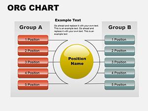
Outpacing vanilla SmartArt, our templates boast thematic icons and flexible connectors, personalizing hierarchies beyond rigid grids. They adapt to changes swiftly, essential for fluid enterprises.
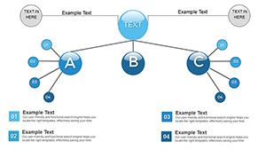
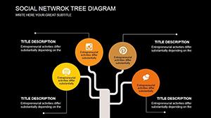
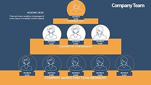
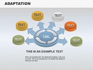
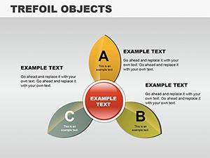
Leaders deploy tree views for vertical commands, branching responsibilities. Consultants use lattice designs for advisory matrices, intersecting influences. Non-profits harness bubble orgs for impact-focused groupings.
With embedded hyperlinks, they surpass standards by linking to bios, streamlining explorations.
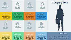
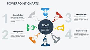
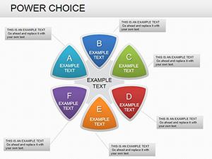
Anchor with central figures, radiating outward for balance. Employ consistent sizing for equity, varying only for emphasis. Embed contact details subtly to aid networking.
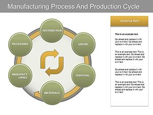
Illustration: An agency illustrated client teams via modular charts, swapping segments per project, streamlining briefs. Universities charted faculties, aiding accreditation visuals.
For multinationals, region-shaded layers denote locales. Periodic audits ensure accuracy, reflecting dynamics.
Empower your visuals - download instantly for structured excellence.
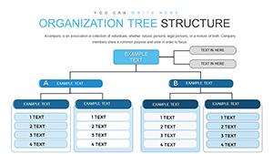
Uncover options like divisional charts for segmented empires or functional silos for specialized flows. Healthcare orgs map care teams, enhancing coordination.
Enterprises prefer holistic trees for empire overviews, bases swelling with support. Sidestep clutter via collapsible branches for depth.
Distribute via OneDrive for collective edits, mirroring real-time shifts. Align with org development timelines for progression stories.
Our PowerPoint org essentials arm you for authoritative depictions.
Copyright © 2009-2026 ImagineLayout All rights reserved.