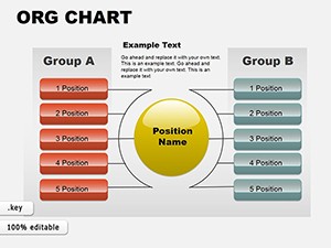
Communicate company structure, reporting relationships, and team organization with confidence using our professional Keynote organizational chart templates.
Over 70 specialized org chart designs range from classic vertical hierarchies to horizontal, matrix, circular, and divisional layouts - all crafted with clean lines, balanced spacing, and contemporary styling perfect for presentations.
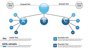
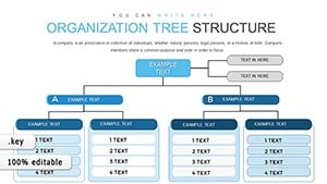
Include photo placeholders, role descriptions, and connection lines that automatically adjust as you add or remove positions.
Perfect for HR updates, onboarding, restructuring announcements, or leadership overviews.
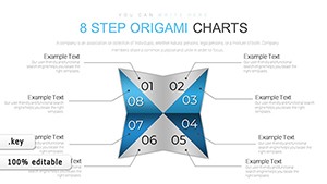
8 Step Origami Keynote Charts: Fold Complexity into Clarity
ID: #KC00685
$16.00
(705)
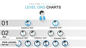
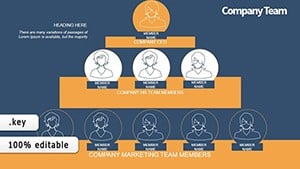
Free Organizational Keynote Chart Template: Structure Your Success Visually
ID: #KC00635
free
(237)
Quality Control Keynote Charts Template: Professional Visuals for Manufacturing Excellence
ID: #KC00560
$25.00
(891)
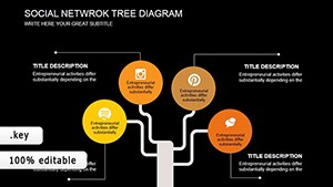
Social Network Tree Keynote Template: Visualize Connections
ID: #KC00456
$18.00
(441)
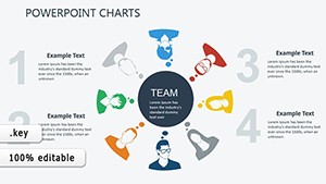
Control Staff Keynote Charts: Org Structures That Command
ID: #KC00340
$16.00
(444)
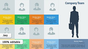
Empower Your Team with Successful Staff Keynote Charts
ID: #KC00337
$16.00
(516)
Organizational Behavior Keynote Charts Template
ID: #KC00330
$20.00
(402)
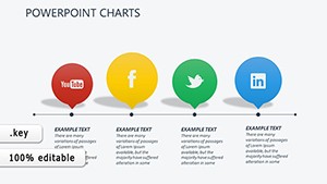
Social Media Keynote Charts Template: Visualize Connections Effortlessly
ID: #KC00323
$19.00
(812)
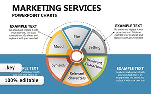
Marketing Plan Keynote Chart Template
ID: #KC00268
$22.00
(892)
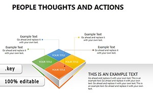
People Thoughts and Actions Keynote Charts: Visualize the Invisible
ID: #KC00254
$22.00
(1080)
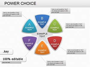
Power Choice Keynote Charts: Unlock Your Decision-Making Potential
ID: #KC00235
$20.00
(669)
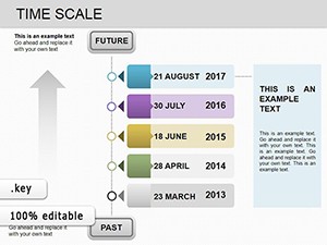
Time Scale Keynote Charts: Mastering Timelines for Business Success
ID: #KC00219
$18.00
(797)
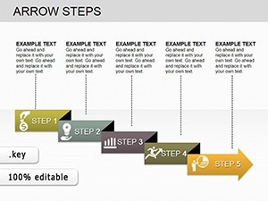
Arrow Steps Keynote Charts: Chart Your Path to Persuasive Presentations
ID: #KC00203
$19.00
(568)
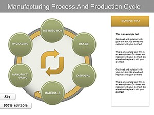
Manufacturing Process Keynote Charts: Visualize Production Cycles with Precision
ID: #KC00178
$25.00
(540)
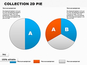
Essential 2D Pie Keynote Charts: Slicing Architectural Data with Precision
ID: #KC00108
$22.00
(282)
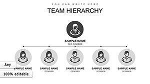
Org Management Structure Keynote Charts: Build Hierarchies with Ease
ID: #KC00071
$17.00
Benefits of Professional Org Charts
Hand-drawn or basic shapes rarely scale well. Our templates maintain perfect alignment, consistent styling, and smart connectors even as your organization grows or changes.
Common Scenarios
Company-Wide Structure Overviews
Show the full organization from C-level to individual contributors with collapsible sections.
Department & Team Charts
Highlight specific groups with role details, headcounts, and contact information.
Restructuring & Change Management
Present before-and-after comparisons or proposed new structures clearly.
Design Tips for Org Charts
Use color coding by department or level
Include photos for better recognition
Keep text concise - name and title only
Provide both detailed and simplified versions
Streamline your next organization presentation - explore our Keynote org chart templates today.
Frequently Asked Questions
Can I add or remove positions easily?
Yes, smart connectors and grouped elements make restructuring simple.
Are photo placeholders included?
Most templates feature optional circular or square photo frames.
Do templates support different layout directions?
Yes - vertical, horizontal, radial, and matrix styles are available.
Can I animate the chart reveal?
Many templates include build-in animations by level or branch.