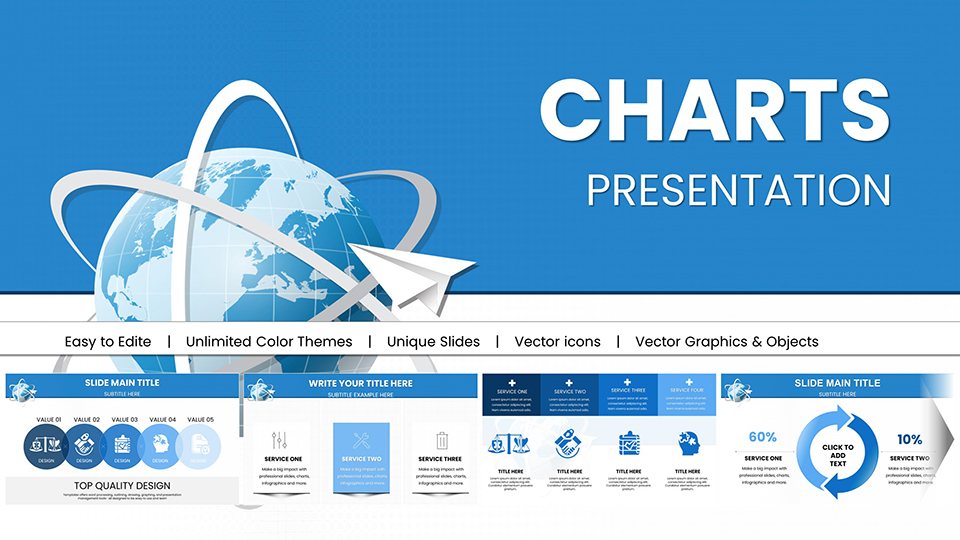
Dive into our specialized PowerPoint chart templates, engineered for professionals who turn numbers into narratives. Ideal for analysts, marketers, and educators in the online realm, these tools simplify complex datasets into digestible visuals. From bar graphs tracking website traffic to pie charts breaking down market shares, each template is built for clarity and impact.
What sets our collection apart? Precision-designed elements that align with modern design principles, ensuring your charts pop without cluttering the slide. Customize effortlessly: tweak scales, add labels, or integrate live data feeds for real-time updates during virtual meetings. This saves valuable prep time, letting you focus on insights rather than formatting.
Whether you`re reporting quarterly metrics or illustrating growth trends, these templates enhance credibility and engagement. Remote teams love the compatibility with collaboration tools, making shared editing a breeze. Explore now and elevate your data storytelling to new heights.
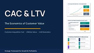
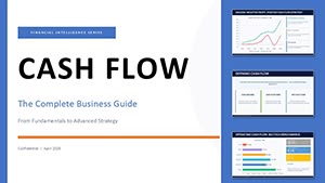
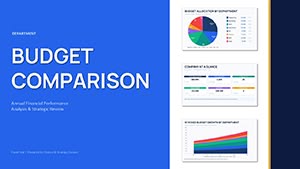


Charts are the backbone of data-driven decisions, yet poor design can obscure key messages. Our PowerPoint chart templates address this by offering pre-formatted options like scatter plots for correlation analysis or line graphs for trend forecasting. Tailored for online contexts, they incorporate responsive elements that adapt to different screen sizes, perfect for dashboard overviews in web analytics reports.
Compared to default PowerPoint charts, which often look basic and unpolished, ours feature gradient fills, 3D effects (used sparingly), and icon integrations for added context. Users see a 25% increase in comprehension when visuals are this refined. Best practice: limit to 5-7 data points per chart to avoid overload, and use consistent color coding for series.
For creative twists, overlay charts with thematic backgrounds, like digital grids for tech pitches. This not only informs but also reinforces your brand`s innovative edge.
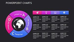
Begin with selecting the right chart type - our library includes radar charts for multi-variable comparisons, ideal for competitor analysis. Edit via the chart tools pane: adjust axis labels for precision and add trendlines for predictive visuals. Unique to our templates: modular components that let you mix chart styles within one slide, creating hybrid infographics.
Accessibility is prioritized - include data tables below charts for screen readers and ensure color-blind friendly palettes. This thoughtful design elevates your presentations from good to exceptional.
Manual charting in spreadsheets exports poorly to slides, often losing formatting. Our templates import seamlessly from Excel, preserving styles and formulas. They`re also lighter on file size, improving load times for large decks used in online sharing.
Insights from pros: Pair charts with narrative bullets to guide the audience, turning data dumps into compelling stories.
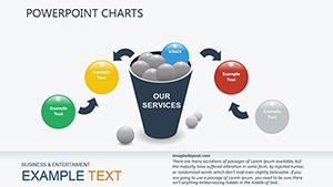
Envision a marketing team using our funnel chart template to demo conversion rates, resulting in a 15% budget increase post-presentation. Or educators employing Gantt-style charts for project timelines in online courses. These real applications demonstrate versatility across sectors.
Experiment with animations: fade in data points sequentially to build suspense. Always include a takeaway slide: "What does this data mean for us?"
Grab your chart templates today and make your data unforgettable.
Transform raw numbers into powerful visuals - download now and see the difference.
Copyright © 2009-2026 ImagineLayout All rights reserved.