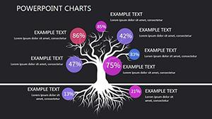
Numeric PowerPoint Charts
Numeric charts make comparisons between values instant and memorable.
Our selection brings together more than 100 high-quality numeric chart PowerPoint templates focused on bar column and stacked variations.
Fully editable with modern styling and built-in animations these designs help you present quantities rankings or differences effectively.
Perfect for reports surveys or performance reviews.
Download free starters or premium collections today.
-
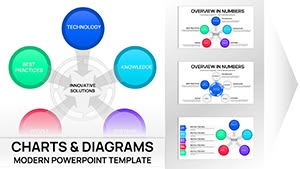
Innovative Solutions PowerPoint Charts Template | 41 Editable Slides - Business Models Ready
ID: #PC01114
-
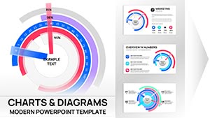
Circular Cycle Diagram Template for PowerPoint
ID: #PC01091
-

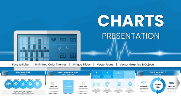
Medical Health PowerPoint Charts Template
ID: #PC01045
-
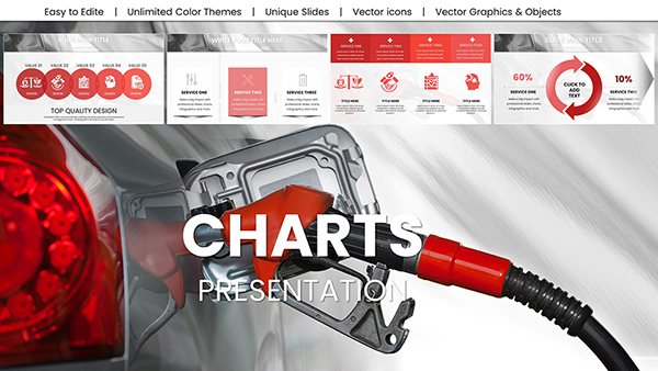
Refuel a Car PowerPoint Charts - Download Editable Presentation Template
ID: #PC00999
-
Healthcare PowerPoint Infographics: Master Medical Data Viz
ID: #PC00978
-
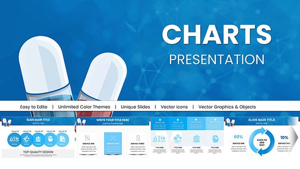
Pill Pharmaceutical Medical PowerPoint Charts: Elevate Healthcare Insights
ID: #PC00977
-
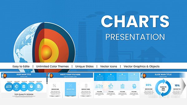
Geothermal Energy PowerPoint Charts: Fuel Sustainable Narratives
ID: #PC00969
-
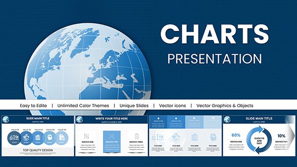
Exploring the Wonders of Our World - Planet Earth PowerPoint Charts
ID: #PC00968
-
Vitamin A Carotenoids Presentation Charts Template
ID: #PC00949
-
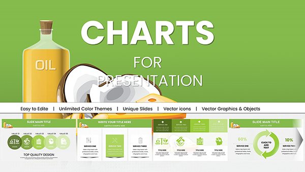
Fats and Oils PowerPoint Charts Template - Nutrition Data Visualization Slides | Fully Editable | Instant Download
ID: #PC00947
-
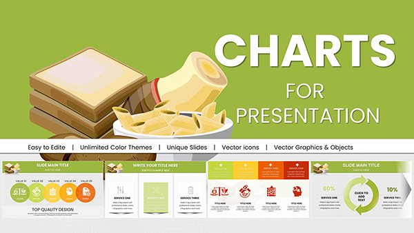
Healthy Food PowerPoint Charts: Your Toolkit for Wellness Wisdom
ID: #PC00946
-
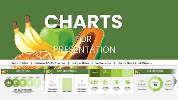
Fruits PowerPoint Charts Template: Infuse Freshness into Your Presentations
ID: #PC00945
-
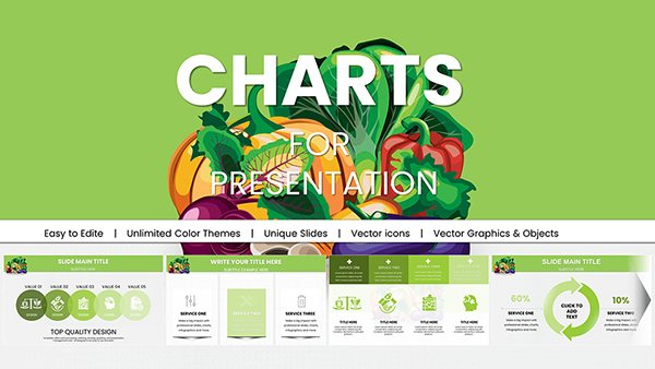
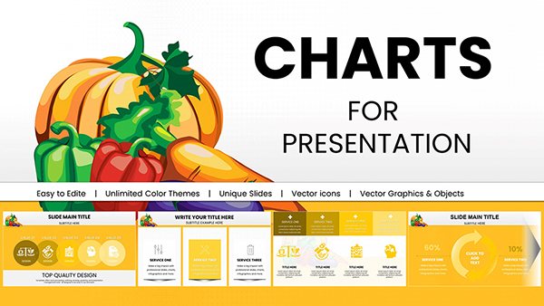
Vegetable PowerPoint Charts & Greengrocery Templates for Engaging Presentations
ID: #PC00944
-
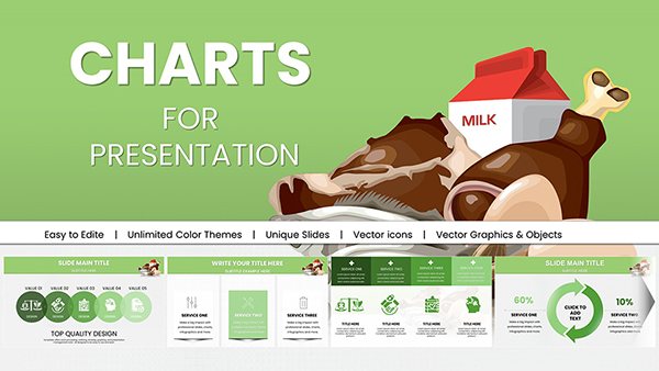
Food Products PowerPoint Charts: Templates for Nutrition and Industry Insights
ID: #PC00943
-

Healthy Foods Infographic PowerPoint Charts Template: Your Guide to Nutrient-Rich Presentations
ID: #PC00881
-

Pie Indicator World Economy PowerPoint Charts
ID: #PC00687
-

Applications & Services PowerPoint Charts Template: Unlock Visual Excellence
ID: #PC00606
-
Professional Business Slideshow PowerPoint Charts: Captivate and Convince
ID: #PC00524
-

Professional Business Charts PowerPoint Template for Architecture Pros
ID: #PC00519
-
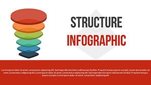
Structure PowerPoint Charts Template: Build Visual Masterpieces
ID: #PC00508
-

Services PowerPoint Charts Template: Elevate Your Professional Presentations
ID: #PC00492
-
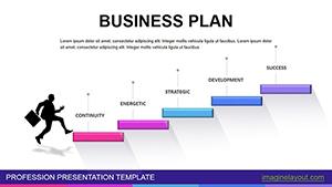
Business Plan PowerPoint Charts - Instant Download
ID: #PC00468
-
Direct Marketing PowerPoint Charts Template: Unlock Data-Driven Insights
ID: #PC00395
-
Social Networks Types PowerPoint Charts: Amplify Your Architectural Reach
ID: #PC00355
Power of Professional Numeric Charts
Default bar and column charts often look plain. Our templates add visual polish depth and engagement without extra effort.
Everyday Use Cases
Sales Comparisons
Compare products regions or team results side by side.
Survey Results
Show response percentages or rating distributions.
Budget Allocation
Display expense categories or revenue sources clearly.
Ranking Presentations
Highlight top performers or market leaders.
Superior Features
- Varied bar styles including horizontal stacked and grouped
- Data labels and value markers
- Color gradients for depth
- Animation options for reveal effects
- Responsive scaling
Pro Tips for Numeric Charts
Sort bars by value for instant insight. Use consistent colors across series.
Add data labels to avoid axis confusion. Start Y-axis at zero for accuracy. Animate bars sequentially.
Ready for clearer comparisons? View our numeric chart collection and download your favorites.
Frequently Asked Questions
Are numeric chart templates free?
Yes. Free templates are available plus premium versions with more styles.
Can I switch between bar and column easily?
Yes. Most templates allow quick chart type changes.
Do templates support stacked charts?
Many include stacked and grouped options ready to use.
Are data labels automatic?
Yes. Values appear automatically and remain editable.