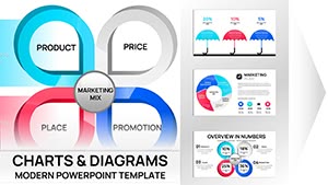
Marketing charts are powerful visuals that turn raw data into actionable insights, helping teams communicate trends, performance, and strategies effectively. From pie charts showing market share to bar graphs tracking campaign ROI, these templates cater to marketers, analysts, and executives seeking clarity in their slides. Our selection includes sleek, modern designs with customizable elements to match your branding and narrative.
Perfect for quarterly reviews, pitch decks, or competitive analyses, these charts simplify complex metrics like customer acquisition costs or conversion rates. With intuitive layouts and eye-catching colors, they ensure your audience grasps key points quickly. Save time on design and focus on your message - explore all templates in this category to find the ideal tools for your next marketing presentation.
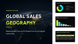


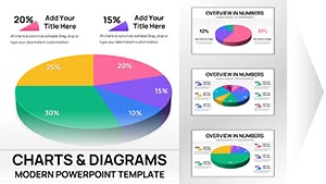
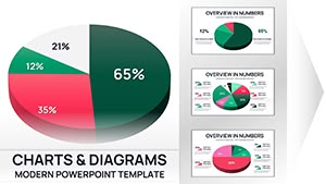
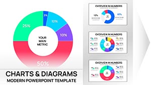
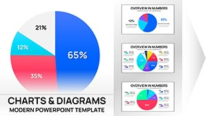
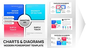
Marketing charts distill vast amounts of data into digestible formats, enabling quick comprehension of metrics like sales growth, audience demographics, or engagement rates. They use elements such as lines, bars, and pies to highlight patterns and comparisons, making them indispensable for strategy sessions and reports. In PowerPoint, these charts integrate seamlessly with data sources, allowing dynamic updates that keep your presentations current.
For example, a line chart might track website traffic over time, revealing seasonal spikes, while a donut chart breaks down budget allocation across channels. This visual approach not only aids in storytelling but also supports data-backed decisions.
Unlike standard PowerPoint charts, our templates offer enhanced aesthetics with gradients, icons, and thematic consistency. They reduce setup time by providing pre-formatted axes, legends, and titles, ensuring professional results without extensive tweaking. Features like tooltips and interactive hover effects add depth for detailed explorations.
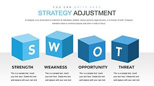
In planning, charts visualize SWOT analyses or competitor benchmarks, using radars or heat maps to compare strengths. Campaign performance reviews employ funnel charts to show lead progression, identifying drop-off points for optimization.
Executives use dashboard-style charts combining multiple visuals for a comprehensive overview of KPIs like CTR and bounce rates.
Monthly reports benefit from stacked bars illustrating revenue sources, while scatter plots correlate ad spend with conversions. These tools make abstract numbers relatable, facilitating discussions with stakeholders on future directions.
For campaigns, bubble charts map audience segments by size and value, guiding targeting efforts. Mood boards incorporate charts to forecast trends, blending data with creative elements for innovative strategies.
These templates boast responsive designs that adapt to different screen sizes, ideal for virtual meetings. They include a range of chart types - from Gantt for timelines to treemaps for hierarchical data - ensuring versatility. High-contrast color schemes improve accessibility, while embedded best practices like clear labeling prevent misinterpretation.
Begin with your data set, choosing a chart type that best represents relationships - bars for comparisons, lines for trends. Customize legends and axes for precision, and incorporate your logo for branding. Use animations to build charts element by element, maintaining audience attention.
Ensure data accuracy by double-checking sources, and test for color blindness compatibility. Limit to 5-7 data series per chart to avoid clutter.
Elevate your marketing narratives - browse and download these essential templates today.
A social media team might use area charts to show follower growth across platforms, pinpointing successful content types. In email marketing, waterfall charts detail open rates to click-throughs, highlighting improvement areas.
Product launches employ gauge charts for readiness metrics, providing at-a-glance status updates to teams.
Default options often feel generic, lacking the polish of our templates' custom fonts and effects. Ours include industry-specific palettes, like vibrant hues for consumer goods or muted tones for B2B, enhancing relevance.
Advanced layering allows combining charts for multifaceted views, surpassing basic capabilities.
Ready to visualize success? Select and download your marketing chart templates now.
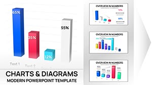
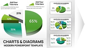
Bar, line, pie, and funnel charts are popular for displaying trends, comparisons, and processes in marketing.
Fully editable, from colors and data to layouts, ensuring they fit your specific requirements.
Yes, they support integration with Excel or other sources for automatic updates.
Many feature subtle animations to reveal data progressively, improving presentation flow.
High-quality graphics, consistent designs, and accessibility features set them apart.
Marketers, analysts, executives, and teams focused on data-driven communication.
Copyright © 2009-2026 ImagineLayout All rights reserved.