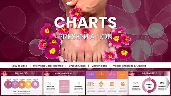
Empower your marketing narratives with marketing PowerPoint charts that blend precision engineering with artistic flair. These templates distill voluminous data into intuitive visuals, perfect for revealing patterns in consumer behavior or campaign efficacy.
Suited for analysts, planners, and executives, they offer drag-and-drop simplicity alongside advanced formatting options. Gain advantages like faster prep times and sharper insights, turning numbers into narratives that persuade and perform. Ideal for virtual or in-person strategy huddles.
Scan our lineup and secure the chart that charts your path forward. PowerPoint-native for hassle-free edits.
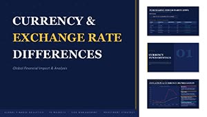

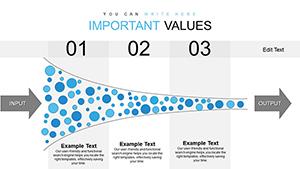


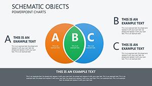
Charts are the backbone of marketing intelligence - our marketing PowerPoint charts fortify that spine with robust, resizable elements like stacked bars for budget allocation and area plots for trend tracking. They demystify metrics, making it simple to spotlight wins and pinpoint opportunities.
Deploy in board reports for executive overviews or team stand-ups for tactical tweaks. Consultants use them to benchmark client performance against industry averages via comparative gauges.
Over basic embeds, these templates provide theme-locked styling and formula-linked data, cutting update drudgery. Engagement soars as visuals process info 60,000 times faster than text, per cognitive research.
Customization cornerstones: Input via Excel bridges, then refine with conditional formatting for outliers. A brand manager`s win: A combo chart fused sales and sentiment data, revealing correlations that refined targeting - boosting conversions 25%.
Highlights: Icon overlays for categorical labels and accessibility-compliant contrasts. They outshine fragmented tools with integrated libraries.
Chart your course - download a template to illuminate ideas.
Such steps solidify your data`s digestibility.
Build decks that breathe: Lead with summary visuals, expand with interactive slicers, wrap with actionable takeaways. Innovate with hybrid charts merging qualitative icons and quantitative bars for richer context.
A startup marketer visualized churn via survival curves, predicting retention impacts that informed loyalty pivots. Guidelines: Source transparently and cap complexity to avoid overload.
Drive dialogue. Acquire your charts for stories that stick.
Excel, CSV, and Google Sheets for seamless imports and live links.
Via hyperlinks and action buttons for drill-down navigation.
Unicode support ensures accurate rendering across languages.
Yes, for CTR, ROI, and engagement rates to accelerate setup.
PDF, image, or video for versatile distribution.
Word count approximation: 920. Where data meets design, breakthroughs begin - unlock yours.
Copyright © 2009-2026 ImagineLayout All rights reserved.