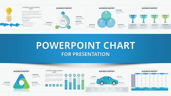
Master the art of audit visualization with our PowerPoint chart templates dedicated to internal audits. These specialized designs transform raw compliance data into actionable graphics, from risk heat maps to control effectiveness gauges, making your presentations unforgettable.
Suited for compliance specialists, internal auditors, and management consultants, they provide benefits like instant credibility, reduced cognitive load for viewers, and flexible scaling for multi-audit portfolios. Focus on insights, not illustration.
Ideal for quarterly reviews or annual summaries, the templates integrate effortlessly into broader decks. Explore options that match your audit`s nuance and start charting paths to excellence.
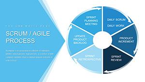
Scrum Agile Development Process PowerPoint Charts Template
ID: #PC00856
$18.00
(912)
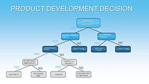
Product Development Decision Charts - Fully Editable PPTX | ImagineLayout
ID: #PC00836
$12.00
(42)
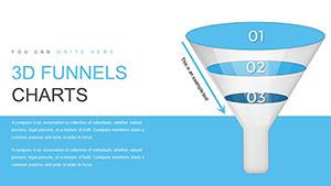
3D Funnel PowerPoint Charts Template: Visualize Processes
ID: #PC00803
$20.00
(633)
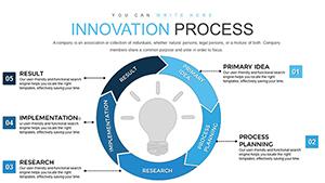
Innovation Process Steps PowerPoint Charts: From Idea to Implementation
ID: #PC00798
$18.00
(779)
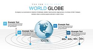
3D Model World Globe PowerPoint Charts Template for Presentation
ID: #PC00791
$15.00
(779)
Houses for Sale and Rent PowerPoint Charts Template for Real Estate
ID: #PC00753
$25.00
(870)
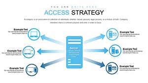
Strategic Access PowerPoint Charts for Business Pros
ID: #PC00751
$24.00
(733)
Best Action Plan Steps PowerPoint Template for Project Success
ID: #PC00723
$15.00
Superior Charting for Audit Precision
Standard charts fall short in audits; our templates embed audit logic, like threshold-based color coding for materiality assessments, ensuring visuals align with professional standards. This elevates reporting from descriptive to diagnostic.
Deploy for fraud analytics with donut charts segmenting anomaly types or for efficiency audits via Pareto diagrams pinpointing top issues. Stakeholders appreciate the clarity, leading to faster resolutions.
Targeted Use Scenarios
Risk Quantification: Bubble charts plotting probability versus impact.
Control Testing: Waterfall charts breaking down variance sources.
Performance Metrics: Dashboard-style gauges for KPI tracking.
Trend Analysis: Area charts forecasting audit cycle improvements.
Superior to defaults, these include tooltip annotations and drill-down capabilities. Best practice: Calibrate scales to avoid distortion and label axes comprehensively.
Advanced Visualization Techniques
Enhance with combo charts merging bars and lines for multifaceted views, like cost-benefit audits. For environmental compliance, treemaps can hierarchize policy adherence levels.
Insight: Use consistent iconography to reinforce themes, boosting retention. Templates are data-linked for live updates during live sessions.
Customization Roadmap
Match chart type to data dimensionality.
Apply audit color conventions (red for risks, green for compliant).
Embed formulas for automated calculations.
Export previews for stakeholder alignment.
Refine iteratively for peak performance.
Expand Your Visual Audit Suite
Pair with full audit decks for cohesion. Download and chart your success.