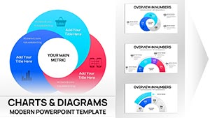
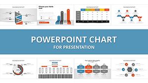
Step up your presentation skills with our integration PowerPoint chart templates, engineered to fuse multiple data streams into unified visuals. Whether tracking merger outcomes or performance metrics, these charts deliver precision and persuasion in every slide.
For data enthusiasts in finance, operations, and sales, they offer intuitive editing tools, from formula embeds to style syncing. Animate evolutions to underscore growth, and export for versatile use.
Make numbers narrate your integration triumphs. Delve into our charts to find the perfect visual ally.
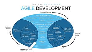
Specialized for blending datasets, these templates feature dual-axis setups and cross-referenced legends, providing deeper insights than standalone charts. They cater to dynamic environments, supporting real-time tweaks during live sessions.
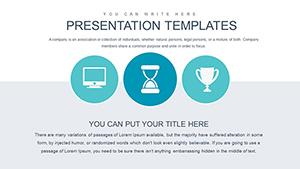
Core Use Cases
Sales Forecasting: Area charts integrating historical and projected sales.
Performance Reviews: Gauge charts merging team KPIs.
Risk Assessment: Tornado charts for variable impacts.
These applications clarify complexities, guiding resource shifts effectively.
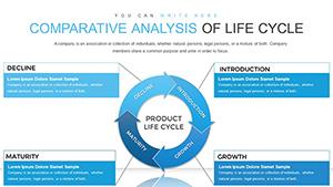
PowerPoint Charts: Enhanced vs. Standard
Standard charts suffice for basics, but ours add integration layers like pivot table links and scenario sliders, enhancing interactivity and accuracy.
Capability
Standard
Our Charts
Data Fusion
Separate inserts
Seamless merging tools
Customization Depth
Basic
Advanced formulas & styles
Export Quality
Standard
High-res for print/web
Chart Best Practices
Choose scales that fit your story - log for vast ranges, linear for steady growth - and avoid 3D effects that distort perceptions. Annotate outliers to contextualize anomalies.
For integrations, use consistent icons across series for thematic unity.
Vivid Chart Examples
A finance analyst charted acquisition integrations: Waterfall visuals broke down cost savings, leading to investor confidence.
Operations used sunburst charts to integrate supply metrics, revealing optimization opportunities.
Analyze with authority - download your chart template and forge ahead.
Frequently Asked Questions
Expert Chart Strategies
Embed formulas for calculated fields on the fly.
Use filters for audience-specific views.
Pair with tables for detailed backups.
Archive data sources for audits.
Elevate your analytics. Connect to diagram resources for fuller pictures.
Chart new horizons - browse and secure templates now.