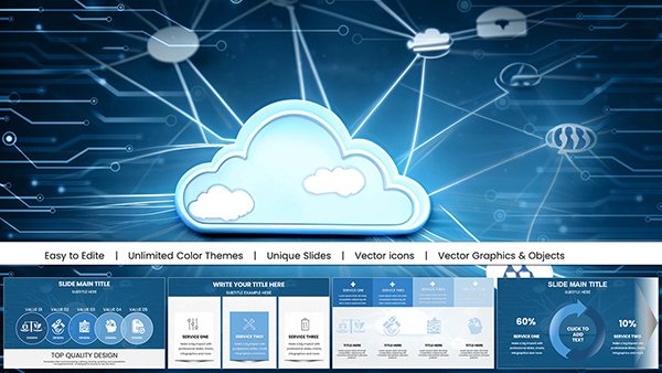
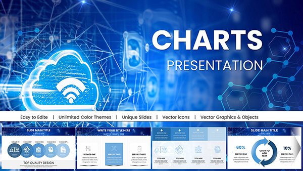
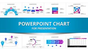
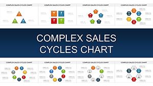
Transform raw information into compelling visuals with our PowerPoint chart templates. Geared toward analysts, trainers, and managers, these designs distill intricate datasets into digestible graphics. From flowcharts mapping workflows to radial diagrams illustrating hierarchies, our collection supports every narrative need.
With drag-and-drop compatibility, embed real-time data links and animate sequences for dynamic reveals. Crisp lines, balanced scales, and neutral palettes ensure focus on facts, not frills. Perfect for annual reviews or skill-building sessions, they enhance comprehension without overwhelming slides.
Step up your data storytelling - peruse our information charts and craft presentations that inform and inspire.


Charts bridge the gap between numbers and understanding, making our templates indispensable across fields. In corporate settings, use Gantt variants to timeline project milestones, clarifying dependencies for teams. Educators employ Venn diagrams for concept overlaps in science classes, fostering critical thinking through visual comparisons.
Marketing pros track campaign ROI with donut charts, segmenting channels for quick insights. Outperforming stock libraries, our versions include pre-formatted axes and legends, cutting setup by hours while maintaining pixel-perfect alignment.
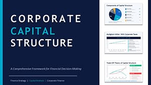
Finance leads populate waterfall charts with quarterly variances, spotlighting profit drivers. The modular builds allow stacking multiple datasets for holistic views.
HR specialists diagram org structures, using tree maps to denote reporting lines. Interactive toggles reveal role details on click, boosting session interactivity.
PowerPoint`s built-ins often default to bland aesthetics, requiring extensive reformatting. Ours arrive theme-aligned, with smart guides for proportional scaling and color-blind friendly schemes. Integrate icons for categorical flair, like gears for processes or bulbs for ideas.
Best practices: Limit series to five for scannability, and use contrasting hues for emphasis. Testimonials highlight 30% faster audience grasp compared to text-heavy alternatives.
Unlock clarity - browse and download to supercharge your visuals.
Layer Sankey diagrams for resource flows in supply chains, revealing bottlenecks vividly. A tech firm credited our bubble charts for nailing investor pitches, visualizing market positioning with size-encoded revenues.
In healthcare, radar charts assess patient metrics, aiding diagnosis discussions. Experiment with hybrid formats, merging lines and bars for trend-plus-composition analyses. These innovations turn data dumps into decision engines.
Complement with tip sheets on visualization ethics or export to infographic tools. Empower your insights - select a chart and illuminate today.
A range from bar, line, pie, to advanced like heatmaps and funnels for diverse data needs.
Use PowerPoint`s data import feature or paste from spreadsheets for seamless integration.
Yes, adjust timing, directions, and triggers to match your presentation rhythm.
Export as .pptx and open directly, with most features preserved.
Optimized for thousands of points, with filtering options to manage complexity.
Copyright © 2009-2026 ImagineLayout All rights reserved.