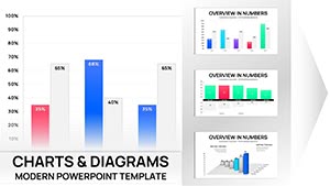
Histograms Keynote Charts

Embrace statistical sophistication through our histogram chart templates for Keynote. Tailored for Apple users in academia, analytics, and consulting, these charts distill distributions into elegant visuals. Ideal for depicting response times or measurement variances, they foster informed discussions with minimal effort.

Leveraging Keynote`s precision rendering, our templates ensure pixel-perfect outputs. Data scientists chart algorithm outputs, while policymakers review poll aggregates. Core strength: Fluid resizing and theme syncing for cohesive decks.

From subtle shading to bold accents, designs prioritize readability. Suited for seminars or strategy sessions, they amplify your expertise. Explore options and integrate one into your next project seamlessly.


View by: Last Added | Most Popular
  • like 4
    (9)
    Modern Real Estate Charts Keynote Template: Plot Your Path to Profitable Pitches
    ID: #KC01057
    $25.00
  • like 4
    (14)
    Microbiology Keynote Charts Template
    ID: #KC01044
    $22.00
  • like 3
    (105)
    Data Visualization Keynote Charts Template: Illuminate Your Insights
    ID: #KC01017
    $18.00
  • like 5
    (15)
    Real Estate Market Keynote Charts: Transform Data into Deals
    ID: #KC00988
    $18.00
  • like 2
    (981)
    Causality Principle Keynote Charts - 42 Editable Slides
    ID: #KC00872
    $18.00
  • like 5
    (674)
    Momentum Concept Keynote Charts: 30 Editable Slides
    ID: #KC00834
    $12.00
  • like 5
    (818)
    Houses for Sale and Rent Keynote Charts: Transform Your Real Estate Presentations
    ID: #KC00753
    $24.00
  • like 3
    (338)
    Effects of Economic Integration Keynote Charts Template: Visualize Global Impacts
    ID: #KC00714
    $20.00
  • like 5
    (429)
    Reliance Trends World Keynote Charts Template
    ID: #KC00708
    $22.00
  • like 4
    (1178)
    Core Values Keynote Charts Template: Visualize Your Guiding Principles
    ID: #KC00699
    $13.00
  • like 3
    (23)
    Advise Sales Analysis Keynote Charts: Transform Data into Actionable Insights
    ID: #KC00695
    $20.00
  • like 5
    (133)
    Free Infographic Concepts Metaphors Keynote Charts Template
    ID: #KC00621
    free
  • like 3
    (1136)
    Assessment of Technical Condition Keynote Charts: Precision in Process
    ID: #KC00605
    $18.00
  • like 4
    (1121)
    Goals and Activities Keynote Charts Template Download
    ID: #KC00602
    $18.00
  • like 4
    (739)
    Sustainable Development Goals Keynote Charts: Inspire Action Through Visuals
    ID: #KC00592
    $15.00
  • like 2
    (320)
    Economic Condition Keynote Charts Template
    ID: #KC00588
    $20.00
  • like 5
    (1017)
    Development Trends Keynote Charts: Visualizing Tomorrow's Innovations
    ID: #KC00581
    $22.00
  • like 3
    (36)
    Methods Forecasting Economic Indicators Keynote Charts: Precision in Economic Analysis
    ID: #KC00580
    $17.00
  • like 5
    (950)
    Unlock the Power of Data with Important Indicators Keynote Charts Template
    ID: #KC00568
    $17.00
  • like 2
    (1151)
    Infographic Mastery: Business Development Keynote Charts That Drive Decisions
    ID: #KC00548
    $20.00
  • like 2
    (926)
    Economic Analysis Keynote Charts: Illuminate Financial Futures
    ID: #KC00544
    $15.00
  • like 5
    (587)
    Master Market Dynamics with Consumer Confidence Keynote Charts
    ID: #KC00541
    $17.00
  • like 5
    (671)
    Entertainment Keynote Charts: Ignite Your Showbiz Story with Data
    ID: #KC00532
    $22.00


Histograms` Role in Keynote Excellence

Keynote histograms partition data elegantly, revealing shapes like uniformity or tails, crucial for hypothesis testing in labs or boardrooms.

Enhanced over stock, with rug plots for granularity, they decode nuances defaults ignore, boosting analytical credibility across domains.

Diverse Implementation Ideas

  • Environmental Studies: Plot rainfall frequencies for climate models.
  • Finance: Examine return volatilities.
  • Psychology: Display reaction time spreads.
  • Logistics: Assess shipment durations.

Maintain integrity with axis transparency and sample notes. Creatively, blend with pie overlays for hybrid frequency-proportion views.

Keynote Optimization Secrets

Exploit build orders for bin-by-bin builds. Instance: In quality reports, sequential reveals highlight deviations, engaging stakeholders progressively.

Unique perk: iCloud collaboration for shared refinements. Include confidence intervals for rigor.

Ready for elevation? Download a Keynote histogram now.

Core Adjustments

  1. Harmonize bins with data range.
  2. Add frequency tables below.
  3. Use builds for emphasis.
  4. Export for web embeds.

These elevate your statistical storytelling.

Impactful Examples

A biotech team mapped gene expression: Peaks indicated expression hotspots, accelerating discoveries. Retailers analyzed purchase intervals, refining stocking.

Playfully, fitness apps visualized workout durations, motivating users. Value: Seamless Keynote-to-PDF transitions.

Frequently Asked Questions

Master distributions with finesse. Select and download templates today for Keynote prowess.