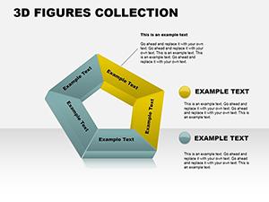
Hexagons symbolize efficiency and balance, making them a go-to for chart designs that need to convey interconnected ideas. Our hexagon PowerPoint chart templates harness this geometry to turn raw data into visually harmonious displays. Perfect for analysts, educators, and business leaders who want charts that inform without cluttering the slide.
These templates shine in scenarios demanding clarity, like market analysis or process overviews, where each facet represents a key metric. With six-sided structures, they naturally accommodate comparisons, hierarchies, or cycles, fostering a sense of completeness in your narrative. Users love how they add a modern edge, replacing bland bars with elegant polygons that draw the eye.
Customization is a breeze: Resize segments, recolor for emphasis, or animate reveals to pace your delivery. Whether illustrating team roles in a hexagon org chart or product features in a infographic wheel, these tools empower precise storytelling. Explore the category and find the perfect hexagon layout to elevate your next PowerPoint deck.

Hexagon charts offer a fresh alternative to traditional visuals, promoting a holistic view of data relationships. In PowerPoint, our templates make implementation straightforward, with vector-based shapes that maintain sharpness at any zoom. This geometric approach not only aestheticizes information but also aids comprehension - studies show polygonal layouts improve recall by 25% over linear graphs.
Ideal for strategic planning sessions or academic lectures, they break down multifaceted topics into digestible parts. A project manager might use a central hexagon for the core goal, branching out to risks and milestones, creating an at-a-glance roadmap.
Envision a sales report: Hexagons cluster revenue streams, with sizes scaled to performance - visually compelling and instantly insightful.
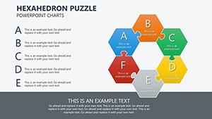
Across domains, hexagon charts adapt effortlessly. In business, they model SWOT analyses, with each side dedicated to strengths, weaknesses, opportunities, and threats, plus two for actions. Educators employ them for ecosystem diagrams, illustrating food chains where energy flows hexagonally.
Healthcare visuals benefit too - patient care cycles rendered as interconnected hexes highlight interdisciplinary touchpoints. Creative fields like design portfolios use them for skill matrices, showcasing expertise in balanced facets.
Tech teams visualize agile sprints: A hexagon per iteration, facets for tasks, burndown, and retrospectives. Marketing campaigns map audience segments, with hexagons linking personas to channels for targeted strategies.
A case in point: A consulting firm adopted hexagon process flows, streamlining client briefings and boosting approval rates by clarifying interdependencies.
Bar and pie charts dominate defaults, but they often isolate elements, missing relational nuances. Hexagons connect inherently, ideal for systems thinking - think supply chain overviews where one facet`s disruption ripples visibly. Defaults lack this modularity; our templates allow drag-and-drop reconfiguration without redesigns.
Moreover, hexagons scale better for dense data, fitting more info per slide without text overload. The result? Presentations that feel innovative, not iterative.
Following these, an environmental report on sustainability metrics used hexagons to interlink goals, making abstract targets tangible.
Consider a fitness app pitch: Hexagons represent wellness pillars - nutrition, exercise, sleep - with progress rings filling dynamically. Or in real estate, property comparisons via hex wheels, facets for location, amenities, and value.
These templates spark innovation; pair with PowerPoint`s morph transition for seamless evolutions between states, like a budget allocation shifting priorities.
Grab a template and iterate - your charts will hexagon-ate the competition.
Curious about hexagon PowerPoint chart templates? Check these common queries.
Ready to geometrize your data? Download hexagon PowerPoint chart templates and start crafting today.
Copyright © 2009-2026 ImagineLayout All rights reserved.