Bring geometric elegance to your Apple Keynote decks with our specialized hexagon chart templates. Designed exclusively for Keynote users, these visuals harness the platform`s smooth animations and high-fidelity rendering to make your data shine.
Ideal for designers, tech innovators, and sales teams, hexagon charts in Keynote offer a sleek way to depict relationships and progress. Their faceted forms evoke innovation, aligning perfectly with Apple`s minimalist ethos. Say goodbye to bland spreadsheets - our templates turn numbers into narratives that resonate.
With drag-and-drop editing and theme compatibility, integration is effortless. From startup pitches to annual reviews, these charts ensure your content is both informative and inspiring. Browse our selection and infuse your next presentation with structured creativity.


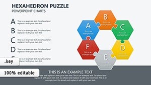
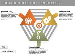
Hexagon charts in Keynote leverage the software`s advanced transitions, allowing segments to assemble like puzzle pieces for mesmerizing reveals. This interactivity sets them apart from static alternatives, fostering deeper audience engagement in creative or corporate environments.
Tech professionals use them for algorithm flows, where each hexagon represents a computational step. Creative directors map campaign elements, linking hexagons for media channels and ROI metrics. The result? Slides that feel alive and purposeful.
Standard Keynote charts often appear dated; our hexagons introduce a contemporary edge with layered transparency options, ideal for overlaying supplementary info without overwhelming the viewer.
In marketing, visualize customer journeys with a central hexagon for awareness, branching to conversion stages - each annotated with engagement stats. For education, Keynote`s precision shines in illustrating molecular models, hexagons denoting atoms and bonds.
Non-profits chart impact metrics, using hexagons to show program interconnections and funding allocations. These versatile tools adapt to any narrative, emphasizing connectivity over isolation.
Test animations in presenter view to fine-tune timing, ensuring smooth delivery.
Begin with Keynote`s master slides to embed hexagon styles globally, saving reformatting time. Use the inspector panel for precise alignment, and incorporate Magic Move for seamless scene changes between charts.
For accessibility, add alt text to shapes and ensure sufficient contrast. With these techniques, your presentations will not only inform but also enchant.
Ready for dynamic designs? Download your favorites and craft standout stories.
Discover more Keynote innovations and perfect your pitch.
Copyright © 2009-2026 ImagineLayout All rights reserved.