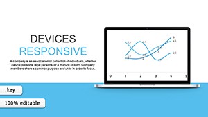
Charts in Keynote bring statistics to life, leveraging the app`s smooth rendering for impactful visuals. Our templates suit data enthusiasts, analysts, and presenters aiming to demystify figures with style.
Covering histograms to bubble charts, designs feature editable datasets and thematic styling. Animate data points to reveal insights progressively, captivating viewers.
For sales forecasts or research summaries, these charts clarify and convince. Integrate one and elevate your analytical edge.
Charts clarify in critical moments. Marketers track campaign ROI with funnel visuals. Researchers plot correlations via dual-axis lines.
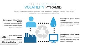
Coaches monitor progress with gauge dials. Economists use heatmaps for regional data. Journalists visualize polls with donut slices.
Precision informs action.
Native charts constrain to simple series; ours handle multi-variate with combo types. Defaults skip smart labels, but we auto-generate for clarity. Enhanced legends and tooltips add interactivity.
Scalable for large screens.
| Function | Basic | Pro |
|---|---|---|
| Series Capacity | Limited | Unlimited |
| Label Automation | Manual | AI-assisted |
| Animation Sync | Uniform | Staggered |
Depth defines distinction.
Formula integration for live calcs. Color harmony tools. Export to vector SVGs. Themed for industries like health or finance.
Match types to stories: areas for volumes, columns for parts. Zero-base axes for accuracy. Highlight outliers.
A climate trend area chart with shaded confidence intervals educates elegantly.
Download and decode data masterfully. Insights ignite.
Answers accelerate.
Copyright © 2009-2026 ImagineLayout All rights reserved.