Turn numbers into narratives with our free Keynote chart templates, leveraging Apple`s smooth rendering for charts that captivate. Spanning bar series to network diagrams, these are for data-driven pros in finance, research, or marketing who want visuals that enhance, not eclipse, their points. They make decoding datasets a delight.
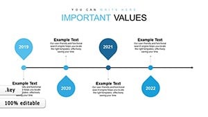
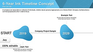
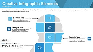
Envision a Keynote slide where bars pulse in with easing curves or lines weave like threads in a tapestry - native effects that feel alive. Quick to populate with your figures, scalable for any complexity, from simple comparisons to multifaceted models. Suited for strategy sessions, academic papers, or sales forecasts, they clarify chaos into clarity.
With themes from professional neutrals to vibrant pops, all harness Keynote`s precision. Choose, adapt, and animate. Explore the full array of free Keynote chart templates and chart your data destiny.

Stock graphs lack finesse; ours add shadows, gradients, and builds for dimensional appeal, aligning with Keynote`s aesthetic ethos.
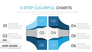
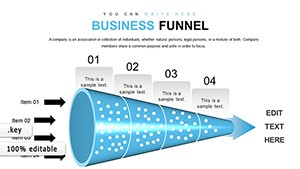
Marketers track ROI with funnel cascades, researchers plot correlations via scatter blooms. Consultants diagram strategies as mind-map branches.
Linked to Numbers app, updates propagate instantly.
Scale thoughtfully: Axes clear, legends intuitive. Animate paths for sequential insights, matching verbal cues. Use themes for instant cohesion.
A fintech pitch used our templates to animate growth curves, sealing a deal. A scientist`s evolution chart with morphing forms engaged conference crowds.
Yielding charts that inform and inspire.
Geo-maps with pin drops or heat overlays for spatial data. Interactive toggles via hyperlinks for deep dives.
Narrate via annotations: Arrows guiding eyes to peaks. Adored by Apple faithful for fluid finesse.
Plot ahead? Peruse free Keynote chart templates and download dynamos. Let data lead.
Copyright © 2009-2026 ImagineLayout All rights reserved.