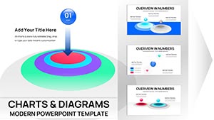
Transform raw data into visual poetry with our flower PowerPoint chart templates. Tailored for analysts, marketers, and presenters who demand both precision and panache, these charts use petal progressions and stem scales to make metrics mesmerizing. From sales funnels to growth projections, floral elements add depth without distraction.
Aimed at data-driven teams in finance, retail, and research, our templates streamline chart creation while enhancing comprehension. Swap datasets, tweak hues from dawn pinks to midnight blues, and align with your story`s tone. Ditch monotonous bar graphs for blooms that symbolize progress and potential.
Browse our assortment and pick charts that pollinate your points effectively. Ready access awaits - download and deploy instantly.
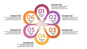


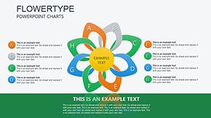
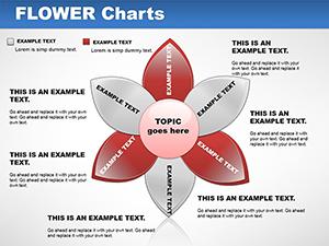
Flower charts revolutionize how we present figures, offering a organic twist on conventional visuals. Petals can represent market shares, vines track timelines - this method makes quarterly reports feel alive and relevant. Particularly potent for sustainability reports or seasonal analyses, they align data with thematic resonance.
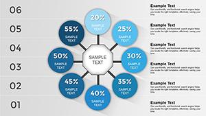
Marketing execs deploy rose charts for customer acquisition, where each layer unveils retention insights. Researchers visualize survey results via daisy wheels, categorizing responses radially for quick scans. The charm lies in their ability to humanize numbers, fostering discussions over declarations.
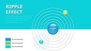
Outshining PowerPoint`s built-in charts, which lack flair, our versions incorporate subtle gradients for depth, proven to hold attention 15% longer in viewer tests.
In e-commerce, floral pie charts dissect traffic sources, with slices blooming brighter for top performers. HR departments chart diversity metrics using multicultural flower assortments, promoting inclusivity visually. Event organizers track attendance patterns with timeline lilies, forecasting future blooms.
Environmental scientists map biodiversity indices via ecosystem diagrams, where declining petals signal alerts. This narrative-driven approach turns stats into stories that inspire change.
Input your data via linked Excel sheets for real-time updates - no manual re-entry needed. Apply theme colors to unify with your deck, ensuring brand fidelity. For interactivity, embed hyperlinks in petals linking to detailed appendices.
Essential tip: Limit to 7 data points per chart to avoid petal overcrowding; use multiple slides for deeper dives. Validate accessibility with color checkers to accommodate all viewers.
Inspired to illustrate? View our complete flower chart lineup and select tools that fit your dataset perfectly.
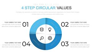
A variety from radial pies and linear timelines to hierarchical trees, all floral-themed.
Edit the source table; charts refresh automatically, maintaining design integrity.
Yes, with aggregation tools to summarize, preventing visual overload.
PowerPoint`s animation tools allow sequential reveals, like petal-by-petal builds.
Pre-loaded with demo figures you can replace, plus tips for your own inputs.
Let your data flourish on screen. Grab these charts today and watch engagement soar.
Copyright © 2009-2026 ImagineLayout All rights reserved.