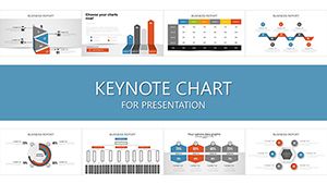
Elevate your Apple Keynote presentations with our specialized chart templates, engineered to blend seamless animations with precise data representation. Perfect for tech innovators, creative directors, and conference speakers, these tools turn spreadsheets into slideshow masterpieces that command attention.
Featuring fluid transitions and high-resolution vectors, our charts - from radial gauges tracking progress to area plots depicting trends - ensure your message lands with clarity and style. Tailored for macOS users, they harness Keynote`s native strengths for quick edits and stunning exports.
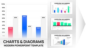
Experience the difference: Audiences retain 80% more from visuals crafted with intent. Whether pitching startups or teaching concepts, our library empowers you to design with confidence. Dive in and discover templates that amplify your narrative.
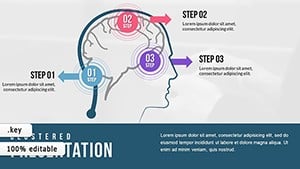
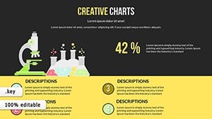
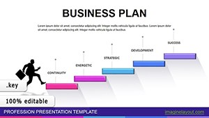
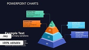
Default Keynote charts suffice for basics, but lack the polish to engage discerning crowds. Our templates counter this with thematic integrations, like gradient fills evoking innovation or minimalist lines for executive brevity. A product demo, for example, gains traction when bubble charts pop with custom icons, illustrating feature clusters vividly.
In creative agencies, these resources facilitate mood board analytics; educators employ them for lesson recaps, making abstract ideas tangible.
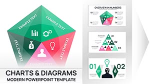
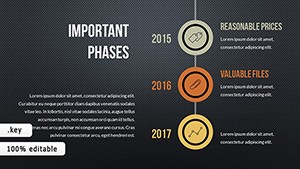
Industry-Specific Scenarios
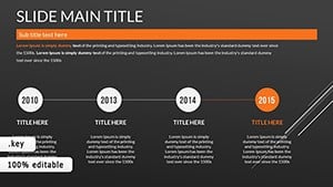
Tech Conferences: Flowcharts mapping app architectures with smooth zooms.
Financial Briefs: Candlestick charts for market volatility insights.
Superior to stock options, ours support layered transparency for depth without clutter. Adhere to principles like one chart per slide and descriptive legends for unassisted viewing.
Innovative Uses and Design Hacks
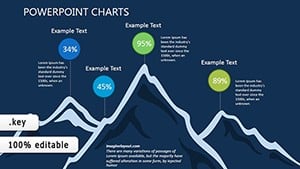
Push boundaries with 3D pie slices for volumetric emphasis or heat maps coloring engagement zones. For storytelling, sequence charts to build suspense, revealing data in narrative beats.
Insider tip: Sync with Keynote`s magic move for chart evolutions across slides, creating cinematic flows. Prioritize vector scalability for retina displays.
Optimization Roadmap
Define objectives: Match chart complexity to time allotted.
Refine iteratively: Preview in presenter view for pacing.
Export strategically: Choose 4K for venues, optimized for web shares.
Intrigued? Scan the gallery for your ideal chart companion.
Frequently Asked Questions
What makes these Keynote templates unique?
They leverage Keynote`s animation engine with pre-built triggers for dynamic reveals.
Are animations editable in these chart templates?
Completely - tweak timings and paths via the build order panel.
Do they include mobile-optimized charts?
Yes, responsive designs scale perfectly for iPad presentations.
How many chart varieties are available?
Over 50, spanning linear, radial, and hierarchical formats.
Bring your data to life vividly. Secure your template and prepare to dazzle.