Email Keynote Charts

Our Keynote chart templates focused on email provide visual tools for presenting data like engagement rates and campaign performance. These designs make complex stats accessible through intuitive graphics.

Including bar graphs for comparisons, pie charts for breakdowns, and line trends for growth, they`re perfect for analysts and marketers. Fully editable, they integrate seamlessly into larger presentations.

Visualize your data effectively - explore all templates in this category to boost your analytical storytelling.


View by: Last Added | Most Popular
  • like 4
    (16)
    Music Charts Keynote Template: Harmonize Your Data Story
    ID: #KC01035
    $18.00
  • like 3
    (1117)
    Personal Protective Equipment PPE Keynote Charts: Illustrate Safety Effectively
    ID: #KC00888
    $18.00
  • like 3
    (498)
    Drive Awareness with Preventing Sexual Violence Keynote Template
    ID: #KC00879
    $15.00
  • like 4
    (721)
    Oil Report Keynote Charts: Mastering Global Market Insights
    ID: #KC00792
    $17.00
  • like 2
    (888)
    Important Questions Cycle Keynote Charts Template
    ID: #KC00623
    $6.00
  • like 4
    (821)
    Analysis & Planning Keynote Charts: Chart Your Path to Strategic Brilliance
    ID: #KC00593
    $18.00
  • like 2
    (848)
    Analytical Thinking Keynote Charts
    ID: #KC00576
    $19.00
  • like 4
    (499)
    Project Timeline Keynote Charts Template
    ID: #KC00500
    $20.00
  • like 3
    (1062)
    Project Timeline Charts Keynote Template for Architects
    ID: #KC00466
    $20.00
  • like 3
    (639)
    Dark Pyramids: Explore Needs & Shadows in Keynote
    ID: #KC00369
    $18.00
  • like 4
    (192)
    Analytical Data Keynote Infographics: From Numbers to Narratives
    ID: #KC00350
    $17.00
  • like 2
    (918)
    Progress Movement 3D Keynote Charts: Advance with Visual Depth
    ID: #KC00341
    $18.00
  • like 5
    (516)
    Organizational Behavior Keynote Charts Template
    ID: #KC00330
    $20.00
  • like 4
    (229)
    Directive Keynote Charts: Empower Sales Teams with Strategic Visual Tools
    ID: #KC00288
    $19.00
  • like 2
    (926)
    Eco-Impact Keynote Charts: Visualize Sustainability Like Never Before
    ID: #KC00319
    $20.00
  • like 4
    (4)
    Dynamic Temporary Project Keynote Charts: Fuel Your Project Momentum
    ID: #KC00257
    $17.00
  • like 2
    (446)
    Trefoil Objects Keynote Charts Template
    ID: #KC00112
    $20.00
  • like 4
    (85)
    Innovative Folium Objects Keynote Charts Pack
    ID: #KC00111
    $19.00
  • like 4
    (971)
    Business History Timeline Keynote Charts: Chronicle Your Success Story
    ID: #KC00084
    $14.00
  • like 3
    (5)
    3D Project Timeline Keynote Charts
    ID: #KC00039
    $24.00
  • like 5
    (685)
    Traffic Lights Keynote Charts Template: Illuminate Your Urban Traffic Strategies
    ID: #KC00032
    $25.00


Value of Chart Templates in Email Keynote Decks

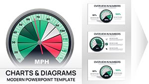
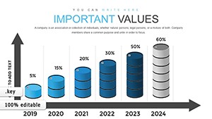
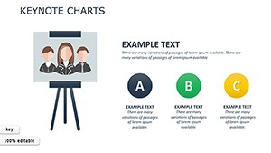
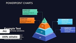
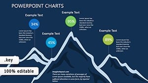
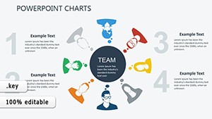
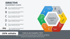
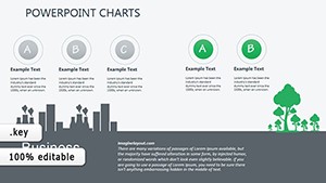
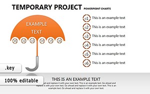
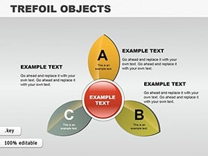
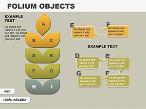
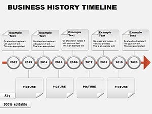
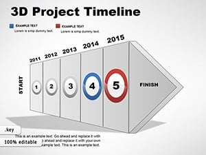
Chart templates tailored for email data transform raw numbers into compelling visuals, aiding in quick comprehension during meetings. They support various chart types with color schemes optimized for clarity.

Data teams use them to report on subscriber metrics, with customizable axes and legends. Executives rely on them for quarterly reviews, highlighting key performance indicators.

Specific Implementations in Analysis

For A/B testing results, bar charts compare variants side-by-side. Trend lines track open rates over time in strategy sessions.

  • Performance Dashboards: Multi-chart layouts for overviews.
  • Forecasting: Scatter plots for predictions.
  • Segmentation: Donut charts for audience splits.

These help in data-informed decisions.

Beyond Basic Charts

Basic charts lack customization depth; ours offer animation options and data import features, speeding up creation.

Enhanced visuals lead to better stakeholder buy-in.

Core Features and Flexibility

Include smart objects for easy data updates and theme consistency across slides. Flex to fit any dataset with scalable elements.

Templates are optimized for Keynote`s tools, ensuring smooth edits.

Usage Best Practices

Select charts that match your data type, avoiding overload with too many elements. Label clearly for standalone understanding.

  1. Input accurate data first.
  2. Adjust aesthetics for branding.
  3. Test animations in presentation mode.

This approach maximizes impact.

Advanced Applications

Use in reports on bounce rates or for training on metrics interpretation. Adapt for client pitches showing campaign successes.

Discover templates that elevate your data narratives.

Sample Charts and Tips

Example: Line chart for click-through trends, with tooltips for details. Tip: Use contrasting colors for key data points.

Users find these enhance clarity in complex analyses.

Start visualizing - download your charts today.

Frequently Asked Questions

Can I import data from spreadsheets?

Yes, copy-paste or link from Excel for updates.

Are charts interactive?

In Keynote, add hyperlinks or animations for interactivity.

What chart types are included?

Bar, line, pie, area, and more variations.

Do they work on iPad Keynote?

Fully compatible with touch edits.

Can I change colors easily?

Yes, theme tools allow quick palette changes.

Are legends customizable?

Position, size, and text are all editable.