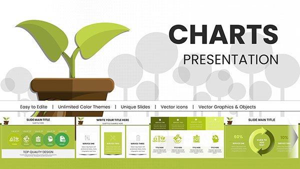
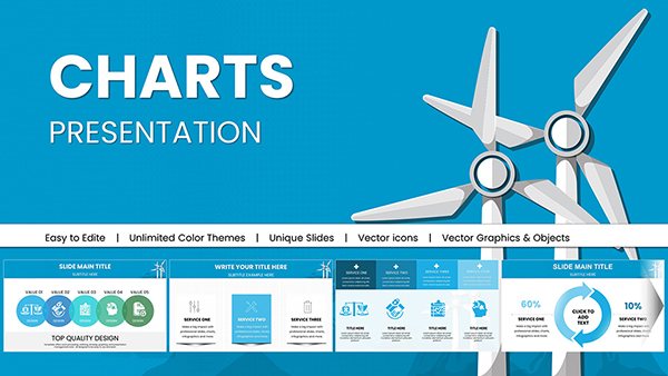
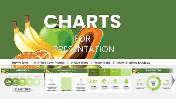
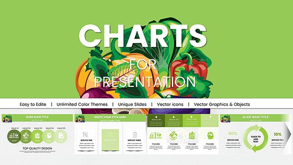
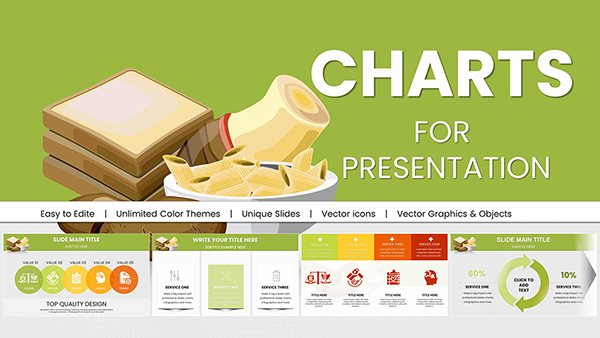
Present sustainability data beautifully with our eco-inspired chart PowerPoint templates. These green-themed designs align perfectly with environmental topics while maintaining professional appeal.
Dozens of nature-conscious templates featuring organic colors leaf icons and clean layouts with animations available.
Great for CSR reports climate presentations or green business initiatives.
Try free eco templates or choose premium for richer details.
Communicate your commitment to sustainability through thoughtful visual design.
Eco-themed charts help reinforce environmental messages by using natural color palettes and subtle nature motifs that complement sustainability content.
Our templates balance aesthetics with functionality for impactful green presentations.
Environmental organizations showing conservation impact or species data.
Green businesses highlighting renewable energy adoption or waste reduction.
Educational programs teaching climate change or ecology.
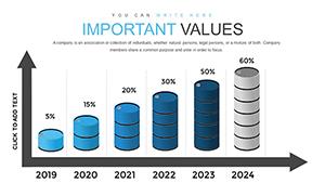
Carbon emissions over time
Recycling rate comparisons
Renewable vs non-renewable energy share
The visual harmony strengthens the message of responsibility.
Advantages of Themed Professional Templates
Eco templates offer coordinated green palettes nature icons and harmonious layouts that generic charts can't match creating a cohesive sustainable narrative.
Tips for Eco-Friendly Chart Design
Enhance your eco slides by:
Using earth tones and greens consistently
Incorporating subtle leaf or water elements
Keeping designs clean to reflect simplicity
Highlighting positive trends with brighter accents
Explore our eco chart templates and download one to support your sustainability story.
Frequently Asked Questions
Do eco templates use sustainable color schemes?
Yes all feature natural green earth tones and organic palettes.
Are nature icons included?
Many templates incorporate leaves trees or water elements tastefully.
Can I use these for non-environmental topics?
Yes the clean designs work well for any professional presentation.
Are animated eco charts available?
Premium versions include gentle animations that fit the natural theme.