Bring your global ideas to life with our Earth map Keynote templates. Designed for professionals these templates allow you to present international data trends educational topics or corporate strategies with clarity and style.
Each map is fully editable in Keynote so you can adjust colors regions and markers to fit your project. Whether for marketing lessons or environmental presentations these templates help your audience grasp complex information effortlessly.
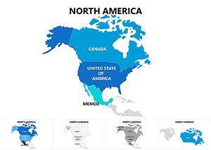
Complete North America Keynote Maps: Comprehensive Geographic Mastery
ID: #KM00078
$18.00
(52)
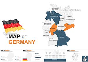
Customizable Germany Keynote Maps Template
ID: #KM00059
$48.00
(226)
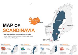
Editable Scandinavia Keynote Maps Template
ID: #KM00058
$50.00
(1197)
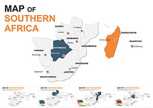
Southern Africa Keynote Maps: Transform Your Presentations with Geographic Precision
ID: #KM00052
$55.00
(49)
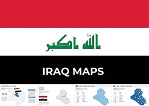
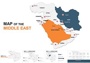
Customizable Middle East Maps Keynote Template: Charting Regional Dynamics
ID: #KM00049
$45.00
(494)
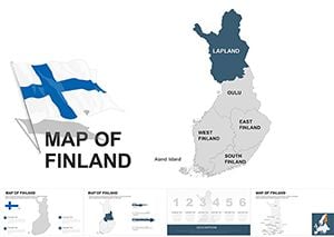
Finland Keynote Maps: Professional Editable Templates
ID: #KM00041
$45.00
(220)
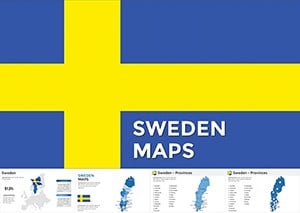
Customizable Sweden Map Keynote Template: Navigate Scandinavian Success
ID: #KM00024
$45.00
(1026)
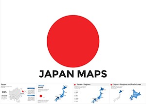
Japan Maps Keynote Template: Infuse Zen into Your Data Narratives
ID: #KM00016
$40.00
(15)
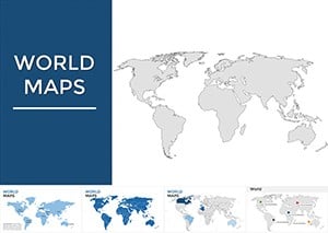
Maps of World Keynote Presentation: Global Insights at Your Fingertips
ID: #KM00002
$38.00
Why Choose Earth Map Keynote Templates
Earth map templates for Keynote offer a professional way to communicate worldwide insights. Unlike default slides these designs are fully editable allowing you to highlight regions add callouts and combine maps with charts or text blocks.
Practical Use Cases
Corporate strategy and international performance reports
Educational lessons on geography climate or world history
Marketing presentations for global audiences
Nonprofit and sustainability projects
Benefits Over Default Templates
Optimized for Apple Keynote
Editable vector maps
Modern 2026 styles
Consistent layouts across slides
Creative Tips and Best Practices
Reveal regions gradually
Use legends for clarity
Pair maps with icons to illustrate impact
Maintain strong contrast for readability
Download a template today and start building visually compelling global presentations that capture attention and communicate clearly.
Frequently Asked Questions
Are these templates compatible with Keynote only
Yes they are designed and tested specifically for Apple Keynote.
Can I customize colors and regions
All shapes and colors are fully editable for your presentation needs.
Do these maps support animated transitions
Yes they work smoothly with Keynote animations.
Are these suitable for business use
They are ideal for corporate and professional presentations.