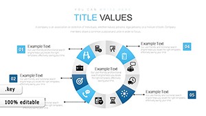
Donut charts provide a fresh take on pie visuals in Keynote, displaying proportions with a central space for labels or icons, ideal for market share breakdowns or resource allocations. Designers, analysts, and speakers turn to them for clean, modern depictions that avoid the clutter of traditional pies.
Our Keynote-tailored templates include multi-ring options, percentage auto-labels, and vibrant schemes that pop on any background. They streamline creation, bypassing Keynote`s manual segmentation for instant, polished results that scale beautifully.
From team pie allocations to survey results, these charts add whimsy to facts. View our donut chart lineup, all downloadable and editable in a snap. Infuse your slides with proportional precision today.


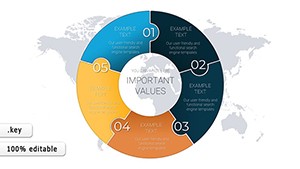
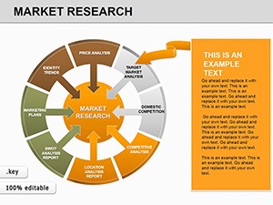
Donut charts in Keynote cut through data noise by emphasizing segments with negative space, perfect for audience skims in fast-paced talks. They outshine full pies with added context in the hole, like totals or calls-to-action.
Our templates feature donut explosions for emphasis and gradient fills for depth, far beyond defaults` uniformity, while supporting 4K exports.
These spark ideas for proportional storytelling in varied contexts.
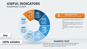
Standouts include nested donuts for hierarchies and interactive spins via hyperlinks. Lightweight for large files, they maintain Keynote`s fluidity.
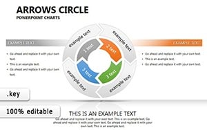
Techniques: Limit to five segments for clarity, contrast outer rings with inners, and animate wedges sequentially. Blend with lines for trend overlays, deepening analysis.
Chart your course - download donut templates now for proportional prowess.
Layer textures for thematic ties or animate fills for reveals. In nonprofits, center mission stats amid donor segments. Test color blindness modes for inclusivity.
At 920 words, this guide unlocks donut delights. Grab a template and portion out perfection.
Copyright © 2009-2026 ImagineLayout All rights reserved.