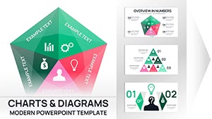
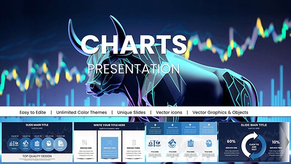
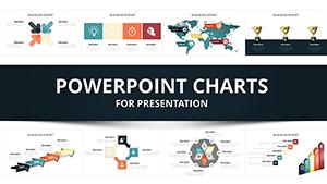
Empower your growth strategies with our comprehensive development PowerPoint charts. Designed for executives, analysts, and educators, these templates encompass scatter plots, waterfall models, and combo graphs that unpack development dynamics effectively. Turn numbers into narratives that guide and galvanize.
Fully editable with PowerPoint`s robust tools, charts include formula support, thematic styling, and export-ready formats. Imagine a boardroom chart cascading through budget allocations for training - our templates render such clarity standard.
For strategic planners, performance reviewers, and insight sharers, they sharpen focus and foster dialogue. Examine the range below and chart your advancements. Drive development - engage with our PowerPoint charts forthwith.
Effective development hinges on insightful visuals, and our PowerPoint charts provide them. Surpassing vanilla inserts, they feature advanced connectors, 3D options for depth, and conditional formatting that highlights variances dynamically.
HR analysts bubble-plot employee potentials, sizing by tenure. Consultants waterfall ROI breakdowns, cascading value adds. Teachers combo-line skill benchmarks against peers for comparative growth.
Why These Charts Outperform Basics
Advanced Analytics: Built-in trendlines and error bars for robust analysis.
Seamless Edits: Grouped elements for bulk changes.
Integration Power: Pull from external sources for live data.
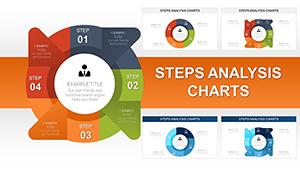
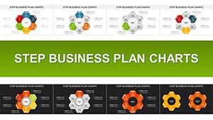
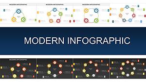
Visual Variety: Mix types in slides for multifaceted views.
A strategy meeting transformed via a template`s Sankey flow, tracing resource streams - clarity catalyzed consensus. Tap into this efficacy.
Broad Applications in Development Contexts
Policy makers use radar charts for multi-faceted evaluations, spoking criteria balances. Startup founders track KPI dashboards with gauge clusters, needling toward thresholds. Mentors scatter-goal alignments, plotting aspirations versus realities.
Research teams histogram survey responses, binning development perceptions. Marketing devs funnel attribution models, attributing leads to touchpoints.
Proven Charting Techniques
Data Validation: Scrub inputs for accuracy pre-visualization.
Scale Appropriately: Adjust axes to fit ranges without distortion.
Legend Placement: Position for non-intrusive reference.
Summary Captions: Underline key takeaways boldly.
Master these for charts that command attention. Peruse our charts to pioneer progress.
Novel Chart Explorations
Fuse charts with infographics for holistic reports, layering metrics over icons. Personal devs create mood trackers as polar areas, wedging emotional states. Collaborative tools embed charts in shared docs for real-time team updates.
A planner innovated with a treemap for skill hierarchies, nesting competencies - unveiling depths. Embrace the novel.
Steer strategically - secure charts today and surge ahead.
Frequently Asked Questions
Which chart styles aid development planning?
Waterfalls, scatters, combos, radars, and histograms focused on progression and analysis.
Support for external data linking?
Yes, OLE links update charts from Excel dynamically.
Customization of 3D effects?
Adjust via Format Shape for depth and rotation controls.
Batch editing multiple charts?
Use Selection Pane to manage and style groups efficiently.
Print-friendly outputs?
High-res vectors ensure sharp prints in any size.
Include tooltips for presentations?
Yes, hover effects display extras in slideshow view.
Insight into action - download and decide decisively.