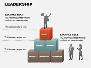
Executive dashboards turn raw metrics into actionable insights at a glance. Our PowerPoint dashboard templates provide sophisticated layouts that combine charts, gauges, and indicators into cohesive, professional overviews.
Built for clarity and impact, these designs feature balanced compositions, intuitive data placement, and subtle animations that draw attention to key performance indicators.
Ideal for business reviews, status reports, and strategic presentations.
A well-designed dashboard provides an instant snapshot of performance, enabling faster decisions and better communication. Combining multiple data visualizations on one slide saves time while maintaining visual coherence.
Effective dashboards balance detail with simplicity, highlighting what matters most.
Over 60 professional templates cover various dashboard types and styles.
All optimized for PowerPoint with modern aesthetics.
Present company-wide KPIs, financial health, and strategic metrics in monthly reviews.
Monitor pipeline, revenue, quotas, and regional performance in sales meetings.
Show timeline progress, budget usage, risks, and milestones to stakeholders.
Track ROI, channel performance, leads, and conversion metrics.
These templates help leaders communicate performance clearly and confidently.
Building dashboards from scratch is time-consuming and rarely looks professional. Our templates provide pre-aligned elements, coordinated color schemes, custom gauge designs, and data-ready placeholders that save hours while delivering superior results.
Select your dashboard template now and elevate your performance reporting.
Key principles:
Creative tip: Use conditional formatting colors (green/yellow/red) for instant status recognition.
Consider interactive elements in digital presentations for deeper exploration.
Executive, sales, marketing, project, operational, and financial dashboard layouts.
Templates support PowerPoint hyperlinks and triggers for basic interactivity.
Edit embedded charts and tables directly - most update automatically.
Yes, several professional free dashboards are part of the collection.
Completely - every element is editable to match your brand guidelines.
Copyright © 2009-2026 ImagineLayout All rights reserved.