Spin your data into compelling visuals with cycling-themed chart templates for Keynote, where numbers race across slides like pros on a peloton. Designed for analysts, coaches, and race organizers, these tools transform raw metrics into dynamic graphs, from velocity vectors to elevation plots.
Gain from built-in formulas, color-coded legends mimicking jersey classifications, and responsive scaling for any dataset. Whether tracking lap times or market shares via "sprint finishes," they make complex info pedal-friendly.
Leveraging Keynote`s charting prowess, these templates ensure seamless updates and exports. Chart a winning strategy today.
Navigate our cycling Keynote charts and accelerate analysis.
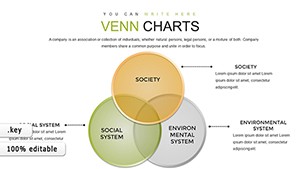
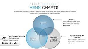
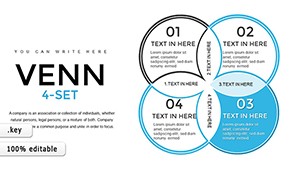
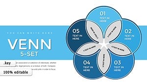
Cycling charts in Keynote capture the sport`s rhythm - line graphs as heart rate undulations, bars as power outputs, pies as energy breakdowns. They excel at temporal data, layering time-series with weather overlays for holistic views.
Use cases: Teams review race telemetry on scatter plots of speed vs. cadence, businesses forecast trends in torque curves, researchers publish findings in podium podiums.
Generic charts are bland dashboards; cycling ones add context - like wind resistance lines on bar stacks - turning data dumps into strategic debriefs that inform tactics.
Prep data in clean CSVs for auto-import. Calibrate axes to real-world scales, like km/h ticks. Use gradients for heatmaps of effort zones. Animate sequentially for buildup tension, akin to a breakaway.
Example: A training log charts weekly progress as a climbing graph, peaks marking PRs with confetti bursts on milestones.
Event planners gauge attendance in funnel drops, nutritionists balance macros in wheel divides, engineers model aerodynamics in vector fields. Integrate gauges for instant RPM reads.
Opt for dark modes for late-night reviews, preserving eye comfort.
From crit loops to gran fondo epics, charts tailor to event scales.
Built on Keynote`s native math, with options for custom scripts for advanced stats.
Link to live sources like Google Sheets for auto-refresh during sessions.
Yes, for volumetric views like terrain profiles in relief.
High-res PNG or vector PDF preserves fidelity.
Toggle metric/imperial seamlessly in legends.
Break away from boring - load a cycling chart template and lead the pack in visuals.
Copyright © 2009-2026 ImagineLayout All rights reserved.