Capture momentum in your slides using cycle pie chart templates for PowerPoint, fusing rotational flows with segmented breakdowns. Ideal for economic trends, life cycles, or resource allocation in professional decks.
For analysts, managers, and teachers, they offer quick edits and vibrant visuals that resonate. Input data, tweak arcs, and apply fades - making stats story-worthy.
Ranging from basic donuts to advanced spirals, all harness PowerPoint`s morphing. Scalable vectors for pro results. Fuel your flow - download immediately.
Revolve around excellence; check our cycle charts.
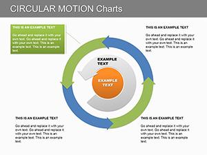

These charts excel at depicting interconnected proportions over time, like budget cycles, outperforming isolated pies by implying continuity.
Enhanced over defaults with preset animations and Excel links, slashing build time. Guideline: Bold key slices; limit to core metrics.
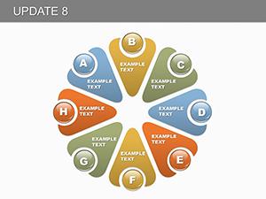
Incorporate shadows for 3D illusion; hyperlink slices to details. Innovate by nesting cycles for multi-level analysis, like yearly within decades.
Sync with slide themes; preview in presenter view. Integrate with SmartArt for expanded narratives, e.g., cycles feeding into org charts.
Tip: Vary segment gaps for emphasis, guiding eyes naturally.
Acquire a cycle pie chart and propel your PowerPoint prowess.Cycle your content to captivate - start with a template today.
Copyright © 2009-2026 ImagineLayout All rights reserved.