Harness the flow of information with our cycle pie chart templates for Keynote, blending circular progressions with proportional slices. Perfect for depicting business cycles, market shares, or workflow loops in elegant, animated formats.
Aimed at data-driven professionals and educators, these templates simplify complex datasets into intuitive visuals. Edit segments, sync with themes, and add motion for engaging reveals - turning numbers into narratives.
Varieties include radial cycles, layered pies, and hybrid designs, all leveraging Keynote`s precision. Vector quality ensures flawless scaling. Ignite your presentations - start downloading.
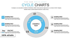
Cycle through our charts and find your perfect fit.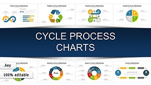


Cycle pie charts uniquely merge sequence and proportion, ideal for showing evolving distributions like seasonal sales. A single glance reveals both parts and progression, unlike linear bars that isolate data.
Superior to Keynote natives, ours feature auto-updating links and gradient fills for depth. Best: Cap segments at 6-8; use arrows for directionality.
Build hierarchies with sub-pies within cycles; animate rotations for emphasis. Creatively, theme around clocks for time-based data, adding metaphorical punch.
Align with brand colors; test animations on varied devices. Pair with timelines for comprehensive views, like annual cycles overlaid on months.
Insight: Use transparency for overlaps, revealing layered insights progressively.
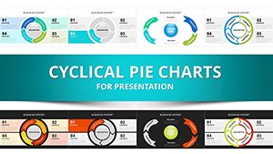
Download your cycle pie template and spin data into action.These charts will cycle your presentations to new heights - explore now.
Copyright © 2009-2026 ImagineLayout All rights reserved.