Capture the ebb and flow of data with periodic cycle templates optimized for PowerPoint. These intricate designs trace repeating patterns, from fiscal rhythms to ecological shifts, empowering precise storytelling.
For strategists, researchers, and consultants, they provide robust frameworks with embedded formulas for auto-calculations. Unravel complexities with grace.
Tweak waveforms, infuse datasets, and trigger fades for revelations. Our prepped palettes save hours. Explore options and elect your era-defining diagram.
Rhythm your results. Snag a template and surge ahead in slide supremacy.


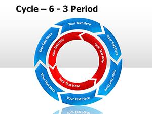
Periodic cycles in PowerPoint delineate rhythmic variations, employing curved paths and markers to chronicle undulations. Morph tools breathe life, transitioning between eras fluidly.
They transcend scatter plots by implying cyclicity, suiting predictive modeling or retrospective audits. Templates arrive with formulaic placeholders for effortless input.
Stock diagrams dull; ours vivify with beveled edges and luminous highlights for trend-spotting allure.
Economists chart GDP oscillations, tagging recessions with caution motifs. Agronomists loop crop yields, correlating with weather nodes.
Marketers pulse campaign ROIs, cresting at peak engagements. Engineers diagram stress cycles in materials testing.
Employ error bars for confidence intervals, bolstering credibility. Cluster cycles thematically for multi-scenario slides.
Harness VBA for dynamic resizing based on inputs. Validate with zoom tests for detail retention.
An energy firm undulates renewable output cycles, solar peaks gleaming gold. Tourism boards wave visitor influxes, dipping in off-seasons.
Stock traders loop volatility indices, alerting to spike thresholds for trades.
Edge: Integrate sparklines within arcs for micro-trend glimpses.
Clarify your cycles here.
Wave goodbye to bland. Template in hand, trend triumphantly!
Copyright © 2009-2026 ImagineLayout All rights reserved.