Unlock the power of visual storytelling with our creative Keynote chart templates, perfect for designers, marketers, and innovators seeking to map out ideas with flair. These aren't your standard graphs; they're canvases for imagination, blending artistry with data to make complex concepts pop.
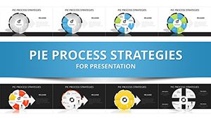
Featuring whimsical layouts like hand-drawn flowcharts, color-exploding pie charts, and interactive mind maps, each template encourages experimentation. Tailor them for brainstorming sessions, where swirling arrows represent idea flows, or mood boards that layer sketches over bar graphs for holistic pitches.
Aimed at creative professionals in advertising, education, and startups, these tools foster collaboration and spark discussions. Keynote's native support means fluid edits on any Apple device, from initial doodle to final reveal.
Whether prototyping a campaign or illustrating a novel theory, these templates turn abstract thoughts into tangible visuals that captivate. Dive into the collection and let your creativity chart new territories!

These templates fuel innovation across creative fields. Graphic designers use them for client mood boards, overlaying trend forecasts with artistic timelines. Teachers craft lesson plans, visualizing narrative arcs via story webs that engage students visually.
Startups pitch visions with hybrid charts merging user journeys and growth projections, blending empathy maps with revenue funnels. Artists document processes, from sketch evolutions to exhibition layouts, preserving the creative journey.
Facilitate wild sessions with radial clusters for mind dumps, color-coding feasibility levels for quick prioritization.
Transform history lessons into branching decision trees, showing 'what if' scenarios with branching paths.
Keynote's defaults are functional but flat; ours infuse personality with 200+ artistic icons, from abstract swirls to pop-art bars, turning data into design statements. No need for external software - everything's vector-based for lossless tweaks.
Collaboration edge: Share live links for real-time annotations, far beyond static exports. Print-ready at 300 DPI for posters, unlike pixelated basics.
Tip: Use opacity gradients to soften data edges, mimicking watercolor effects for softer pitches.
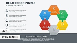
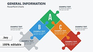
Unique: Modular kits let you Frankenstein charts, like fusing scatter plots with comic strips for narrative data. Best practice: Limit to 5 colors per slide for focus, drawing from psychology for emotional resonance - blues for trust, yellows for energy.
Example: An ad agency visualized brand evolution with evolving mandala charts, winning a major account through mesmerized clients.
Another: Writers mapped plot twists in radial novels, aiding beta feedback sessions.
Inspired? Select and customize a template to visualize your vision.
In product design, prototype flows with tactile-feel icons, simulating user interactions. For events, chart attendee journeys from invite to afterparty, optimizing experiences.
Theater directors storyboard scenes with Gantt-inspired act breakdowns, syncing visuals to scripts.
Yes, pre-set styles make pro results accessible to all.
Keynote's full suite integrates seamlessly with our builds.
All vectors for crisp scaling at any size.
Fonts embed for global presentations.
Direct PDF export/import preserves fidelity.
Chart your course to brilliance - download today and create without limits.
Copyright © 2009-2026 ImagineLayout All rights reserved.