Navigate your professional relationships with precision using our contact management Keynote charts templates. These sophisticated visuals turn sprawling networks into clear, actionable insights, from radial diagrams of key influencers to timeline trackers for outreach.
Suited for sales teams, HR specialists, and networkers, they emphasize clarity and collaboration. Drag-and-drop elements let you update contact details on the fly, while built-in animations reveal connections dynamically during meetings.
Enhance your workflow and impress colleagues with charts that not only inform but also inspire strategy. Explore the collection and map out your success story today.
Transfer Credits Keynote Charts Template: Master Financial Transfers with Dynamic Visuals
ID: #KC00420
$18.40
(449)
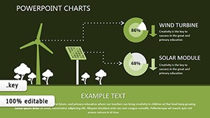
Renewable Energy Keynote Charts: Harnessing Data for a Greener Tomorrow
ID: #KC00399
$16.00
(1076)
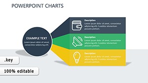
Streamline Your Business Processes with These Keynote Charts
ID: #KC00332
$18.00
(1104)
Infographic Line Confidence Keynote: Data You Can Trust
ID: #KC00298
$8.00
(4)
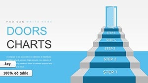
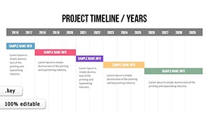
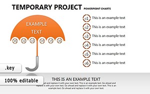
Dynamic Temporary Project Keynote Charts: Fuel Your Project Momentum
ID: #KC00257
$17.00
(33)
Technical Keynote Charts: Elevate Data Precision
ID: #KC00245
$15.00
(633)
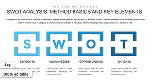
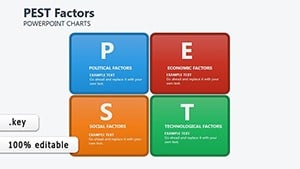
PEST Factors Keynote Charts: Decode External Forces for Strategic Wins
ID: #KC00200
$22.00
(656)
Compliance Analysis Keynote Charts: Navigate Regulations with Visual Precision
ID: #KC00198
$16.00
(121)
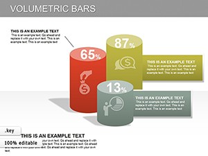
3D Volumetric Bars Keynote Charts: Bring Data to Life in Dimensions
ID: #KC00179
$26.00
(446)
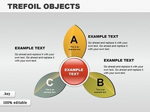
Trefoil Objects Keynote Charts Template
ID: #KC00112
$20.00
(276)
Strength Analysis Keynote Charts Template
ID: #KC00151
$14.00
(480)
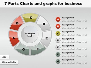
Visualize Success in Segments: 7-Part Keynote Charts for Business Brilliance
ID: #KC00120
$24.00
(1162)
Free Keynote Charts Template: Professional Data Visuals
ID: #KC00064
free
Visualizing Networks for Smarter Management
Contact management Keynote charts templates revolutionize how you handle relationships, replacing chaotic spreadsheets with elegant, interactive displays. Think org charts branching like family trees or bubble maps sizing contacts by interaction frequency - each slide a snapshot of your ecosystem.
For business developers, they spotlight hot leads with color-coded heatmaps; event coordinators use them to plot attendee flows. The edge over basic Keynote charts? Pre-configured for contact data, with formulas linking to external sheets for automatic refreshes.
Practical Scenarios for Chart Deployment
Sales Pipelines: Funnel diagrams tracking prospects from initial contact to close.
Team Rosters: Hierarchical views outlining reporting lines and roles.
Client Portfolios: Scatter plots correlating value and engagement levels.
Event Follow-Ups: Gantt charts scheduling thank-yous and nurture sequences.
Standard charts often lack relational depth; ours embed hyperlinks to profiles, making navigation intuitive and presentations interactive.
Best Practices for Dynamic Contact Visuals
Excel in design by layering transparency for overlapping nodes, ensuring legibility, and using consistent icons for quick scans. A consulting firm streamlined client onboarding with a template`s radial chart, reducing briefings from hours to minutes. Another, a recruiter, visualized candidate pipelines, accelerating hires by 40% through at-a-glance priorities.
Boost utility by integrating with Contacts app exports or CSV imports - seamless data flow keeps your charts current. Select a template now and chart your path to stronger ties.
Chart Creation Essentials
Define your scope: Focus on 5-10 key metrics to avoid clutter.
Choose scales wisely: Linear for timelines, logarithmic for vast networks.
Annotate thoughtfully: Add tooltips for detailed hover info.
Export strategically: PDF for shares, Keynote native for edits.
Frequently Asked Questions
More insights await in our guides - empower your networking game.