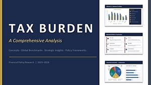
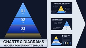
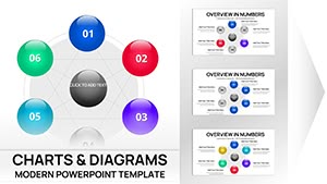
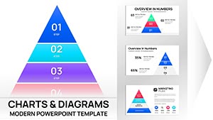
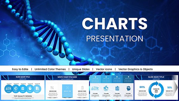
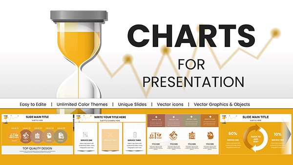
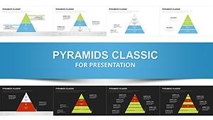
Construction projects are monumental endeavors, blending precision engineering with on-the-ground grit. Our constructor PowerPoint charts collection equips project managers, architects, and site supervisors with visuals that bridge the gap between blueprints and boardrooms. These templates aren't mere graphics; they're robust frameworks for showcasing timelines, resource flows, and milestone achievements in a format that's as durable as reinforced concrete.
Picture this: a Gantt chart that maps out foundation pouring to final walkthrough, with drag-and-drop bars for real-time updates. Or a resource allocation pie that slices labor, materials, and equipment costs, revealing bottlenecks before they harden into delays. Designed for the construction industry, these charts incorporate practical elements like safety compliance icons and weather contingency overlays, drawing from standards set by bodies like the AGC (Associated General Contractors).
Whether you're pitching to investors for a high-rise development or debriefing a team on a residential build, these tools ensure your message lands with impact. Customizable to reflect site-specific data, they support collaboration across dispersed crews via cloud-compatible formats. Transform chaotic schedules into streamlined stories that keep projects on track and teams aligned. Intrigued by how these can fortify your next bid? Explore the lineup and secure your download to construct confidence in every slide.
In an industry where delays cost thousands per day, effective communication is your best crane. Our constructor PowerPoint charts distill sprawling project data into digestible visuals, inspired by methodologies from firms like Bechtel. A case in point: a civil engineering team slashed overrun risks by 30% after adopting timeline charts that highlighted critical paths, proving the power of proactive visualization.
From bid proposals to closeout reports, these templates tackle the unique pains of construction - volatile supply chains, regulatory hurdles, and multi-phase coordination. Forget generic spreadsheets; our designs feature layered Sankey flows for material throughput and bubble charts for subcontractor performance, making variances pop without the fine print fatigue.
These attributes make your presentations as sturdy and adaptable as the structures they depict.
Envision using a PERT chart to sequence tasks in a bridge renovation, identifying float times that prevent cascade failures. Or deploy a cost breakdown bar graph during value engineering sessions, negotiating savings with suppliers through crystal-clear comparisons. A infrastructure project lead shared how our donut charts for risk assessment illuminated weather vulnerabilities, averting a $50K delay.
For safety briefings, radar charts plot compliance scores across crews, fostering a culture of accountability. And in stakeholder updates, infographic timelines compress months of progress into minutes, complete with photo integration hotspots for before-and-afters.
Selecting the right one amplifies your narrative, turning data dumps into decisive dialogues.
Pro tip from seasoned PMs: Layer your charts with conditional formatting - green for on-track, amber for alerts - to enable at-a-glance governance. Integrate BIM exports for 3D-linked data, elevating flat slides to immersive overviews. Users note a 35% uptick in approval rates when visuals align with AIA documentation standards.
Address fieldwork realities too: Opt for high-visibility themes for outdoor projectors and embed QR codes linking to full datasets. Our edge? Eco-friendly vector sources that reduce file bloat, ideal for bandwidth-strapped sites.
Want to reinforce your project pipeline? Grab a trial template bundle and build momentum today.
Supply disruptions? Counter with vendor scorecard scatters that rank reliability. Labor shortages? Histogram shifts forecast hiring needs. Drawing from OSHA guidelines, our safety metric gauges prevent incidents by quantifying hazards upfront - a boon for risk-averse contractors.
Post-project, retrospective fishbones dissect lessons learned, paving smoother paths ahead. These tools don't just report; they propel progress.
Such inclusivity strengthens bonds and bids alike.
They allow you to present cost estimates and timelines persuasively, highlighting value to win contracts over competitors.
Yes, scalable designs handle complex data sets, from highways to skyscrapers, with room for extensive phases.
Definitely - insert images or link CAD elements directly into placeholders for integrated, multimedia presentations.
Our eco-focused variants track LEED metrics, carbon footprints, and green material usage effectively.
Enjoy free revisions as industry standards evolve, delivered via email alerts for hassle-free upgrades.