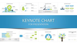
Master data storytelling through our Keynote chart templates, engineered for precision and persuasion. These modular designs turn numbers into narratives, ideal for analytics overviews or performance dashboards.
Aimed at analysts, executives, and researchers, the templates feature scalable vectors, color-coded schemes, and animation-ready elements that reveal trends dynamically.
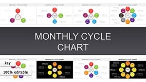
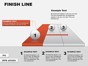
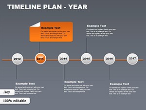
In the tags-constructing category, find specialized charts from radial sunbursts to layered waterfalls, all set for effortless integration into larger decks.
Chart your course - examine the options and integrate data-driven designs now.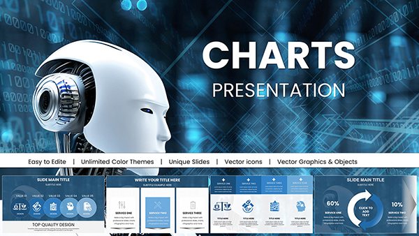


Keynote chart templates facilitate deep dives into datasets, helping teams spot patterns in sales funnels or growth trajectories. Their drag-and-drop interfaces make complex viz accessible.
Superior to native tools with pre-animated builds and theme harmony, they ensure charts complement rather than compete with text.
Prioritize simplicity: Limit series to 5-7 for clarity, and annotate peaks for context. Templates enforce this with bounded canvases.
Native charts require manual styling; ours arrive polished, with data import from Excel for live links. Analysts save 45% on prep, focusing on interpretation.
High-DPI exports maintain fidelity for print or web sharing.
Sequence reveals in quarterly reviews to build suspense, or nest pie slices for hierarchical breakdowns. A data scientist layered our heatmaps for user behavior, uncovering retention drivers.
Harmonize scales across slides for comparability, and employ legends sparingly. For interactivity, hyperlink segments to detail views. Templates include these hooks.
Adapt for themes: Monochrome for reports, vibrant for pitches - swaps take seconds.
Visualize victory: Pick a chart template and populate with your metrics today.These Keynote chart templates demystify data, turning figures into allies. In tags-constructing, they`re your building blocks for clarity. Assemble and analyze with assurance.
Copyright © 2009-2026 ImagineLayout All rights reserved.