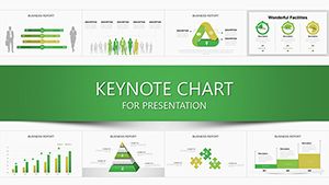
Illuminate data stories with our concept Keynote charts, suited for analysts, educators, and decision-makers. These charts fuse numerical precision with conceptual depth, from trend lines weaving narratives to matrices aligning priorities, all within Keynote`s intuitive interface.
Reshape axes, infuse thematic icons, and synchronize series for visuals that reveal patterns at a glance. Perfect for quarterly forecasts or lesson recaps, they turn spreadsheets into strategic showcases.
Aimed at data enthusiasts in business and academia, these charts democratize insights, making complex correlations conversational.
Chart through the concept category and plot your course to clarity.

Concept Keynote charts transform raw numbers into conceptual tapestries, ideal for distilling insights in Apple`s polished environment. They empower users to layer meanings atop metrics, fostering understanding in high-stakes settings.
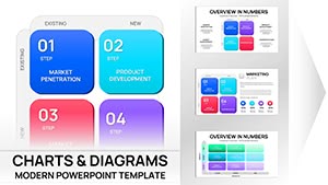
Financial advisors plot portfolio growth, candlesticks symbolizing market sentiments. Teachers chart learning curves, bell distributions highlighting achievement gaps. Event planners timeline budgets, stacked bars apportioning costs to themes.
Default Keynote charts lack conceptual flair; ours embed narrative prompts and icon overlays, elevating data to storytelling heights.
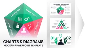
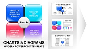
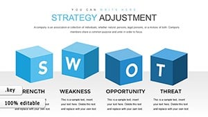
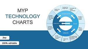
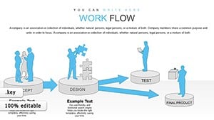
Imagine a summit: a radar chart spins competencies around a leadership core, quadrants illuminating strengths for targeted development.
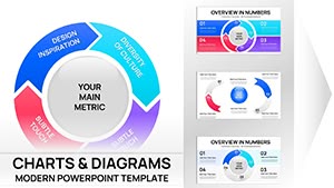
Sales reps forecast pipelines, funnels narrowing leads to closes. Researchers graph hypotheses, scatter plots correlating variables. Fitness coaches track regimens, line graphs ascending wellness metrics.
Marketers measure engagement, heat maps pulsing with click densities.
Anchored in context - pair charts with explanatory bubbles. Vary chart types per section for rhythm, avoiding monotony. Leverage Keynote`s 3D tilts for emphasis on peaks, drawing eyes to pivotal data.
Link to sources for transparency, clickable footnotes validating claims.
Graph your growth - download today.
Augment with gestures: swipe animations on touch devices for sequential reveals. For reports, morph charts across slides, showing evolutions fluidly.
Blend with photos - superimpose metrics on conceptual imagery for metaphorical punch.
Plot your point - secure these charts.
Copyright © 2009-2026 ImagineLayout All rights reserved.