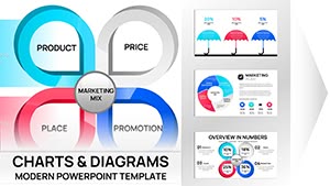
When one chart type falls short, combos step in to weave multiple narratives. Our PowerPoint templates specialize in this, targeting data pros and executives who need to juxtapose volumes, trends, and outliers seamlessly.
Blending clustered columns with smooth lines or adding bubbles for dimensions, these designs handle complexity with grace. PowerPoint`s combo tools shine through editable series and axis tweaks for precise storytelling.
From quarterly reviews to investor decks, they distill volumes into visuals that drive dialogue. Say goodbye to fragmented slides - unite and illuminate. Tour our combo lineup and compose your data masterpiece now!
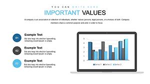
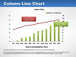
Combos excel at dual storytelling, like pairing categorical bars with continuous lines for context-rich insights. Our templates streamline setup with pre-linked data tables and visual hierarchy cues.
Trumping piecemeal charts, they enforce proportional sizing and error bar integrations for robust analysis.
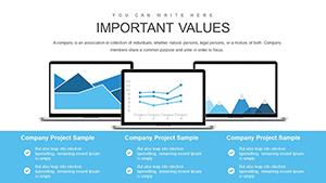
Dynamic Use Cases Revealed
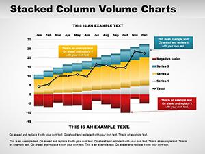
Revenue Tracking: Columns for quarters, lines for YoY growth.
Risk Assessments: Areas for probabilities, scatters for impacts.
Customer Journeys: Steps in bars, satisfaction lines overlaid.
Inventory Balances: Stock levels in columns, turnover rates in curves.
Default combos confuse scales; ours calibrate automatically with optional log axes and series droppers. 40-slide libraries span waterfall-hybrids to radar combos, all high-fidelity.
Link to external sources for dashboard-like dynamism.
Mastery Moves
Group series for collapsible overviews.
Apply trendlines for predictive flair.
Format gaps to emphasize contrasts.
Record macros for repeatable tweaks.
These polish your presentations to perfection.
Success Snapshots and Evolutions
An ops team merged throughput metrics, streamlining processes post-review. HR blended turnover bars with engagement lines, guiding retention strategies. Startups pitched blended funnels, attracting seed funding.
Evolve for reports: add sparklines inside for mini-trends. Analysts use for A/B test overviews, quantifying variants.
Unite your uniques - download a combo chart and blend boldly.
Frequently Asked Questions
Addressing fusion FAQs.
Expand horizons - pair with advanced analytics templates.