Bring clarity to your data with our handpicked collection of column chart PowerPoint templates. These ready-to-use designs make comparisons instantly clear helping your audience grasp key insights faster.
More than 100 unique professional templates featuring sleek modern styles smooth animations and complete editability updated for 2026 presentation trends.
Ideal for sales reports performance reviews or survey results these templates save hours of work while delivering polished results.
Start with free downloads to test the quality or choose premium for advanced features and exclusive designs.
Transform ordinary data into compelling visuals that keep your audience engaged.
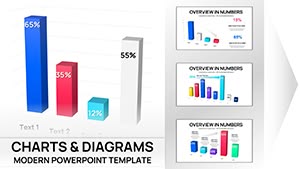
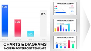


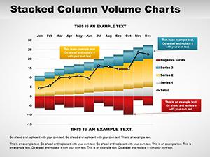
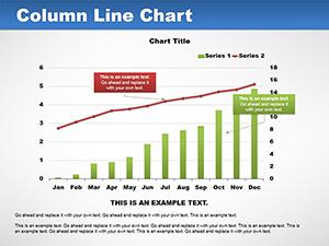
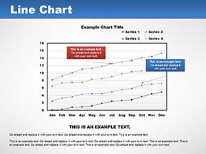
Column charts excel at showing comparisons across categories making them a favorite for presenters who need to highlight differences or trends at a glance.
Our templates enhance this classic format with contemporary designs that feel fresh and professional.
Column charts shine in many scenarios:
In business settings sales managers use them to compare regional performance or product sales helping teams identify top contributors quickly.
Marketing professionals display campaign metrics across channels revealing which strategies delivered the best ROI.
Educators present student results across subjects or semesters making progress easy to understand.
Financial analysts track expenses against budget categories spotting variances instantly.
These examples show how column charts turn numbers into actionable stories.
Default PowerPoint charts work but lack personality. Our templates deliver superior aesthetics built-in animations brand-ready color schemes and multiple variations in one file.
You get time-saving layouts that look custom-designed without the effort.
Follow these practices for standout column charts:
Ready to upgrade your slides? Browse our column chart collection and download your perfect template today.
Yes every element is 100% editable in PowerPoint including data colors fonts and layout.
Yes we have plenty of high-quality free templates with premium options for animations and extra styles.
Many premium templates feature smooth professional animations while free versions focus on clean static designs.
They're best for comparing discrete categories like sales by region or responses by group.
Copyright © 2009-2026 ImagineLayout All rights reserved.