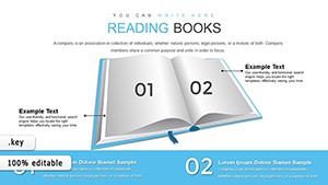
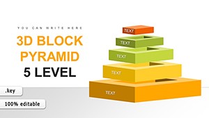
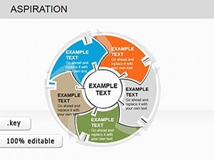
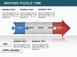
Bring data to life in the classroom with class Keynote charts templates, engineered for educators who inspire through visuals. These templates demystify numbers, turning spreadsheets into engaging stories that students absorb effortlessly. Ideal for K-12 teachers, university lecturers, and training facilitators, they cover everything from pie charts to timelines with educational flair.
Key advantages include interactive elements that encourage participation, color schemes proven to enhance retention, and layouts that adapt to lesson lengths. Crafted in Keynote`s native format, editing is intuitive - no design degree required. Watch as complex topics like fractions or demographics become interactive adventures.
Our assortment ensures variety for every subject. From science graphs to history infographics, find tools that spark curiosity. Elevate your lessons and download your favorites to start visualizing knowledge today.
Class Keynote charts templates go beyond mere illustration; they foster understanding by embedding annotations and legends that guide learners step-by-step. Compared to static images, these animated sequences reveal insights progressively, boosting comprehension in diverse classrooms.
Teachers note that visual aids like these cut explanation time in half, allowing more room for discussions. In STEM fields, for example, a layered bar chart can simulate experiments, making abstract variables concrete.
Optimize by aligning chart types to learning objectives - bar for comparisons, lines for trends - and incorporate student data for relevance. Accessibility features like alt text ensure inclusivity.
Keynote`s default charts suffice for quick sketches but lack pedagogical hooks like quiz integrations or scalable axes for varying skill levels. Our class templates address this with pre-set formulas and exportable datasets for homework extensions.
| Capability | Default Charts | Class Templates |
|---|---|---|
| Interactivity | Limited animations | Quiz-linked reveals |
| Educational Tools | None | Annotations and glossaries |
| Adaptability | Fixed scales | Auto-adjusting for data ranges |
Such enhancements make lessons memorable, correlating with improved test scores across grades.
Incorporate gamification: Tie chart progress to points for correct interpretations. For virtual classes, embed hyperlinks to videos within bubbles. Blend with multimedia for hybrid charts that include audio explanations.
Insight: Poll audiences mid-presentation to update charts live, turning passive viewing into active learning.
Make every lesson a visual triumph. Peruse class Keynote charts templates and secure downloads to ignite student interest immediately.
Copyright © 2009-2026 ImagineLayout All rights reserved.