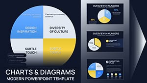
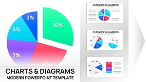
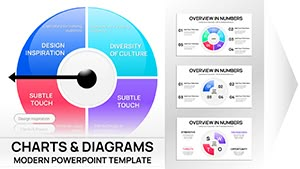
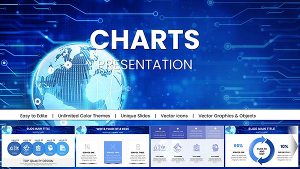
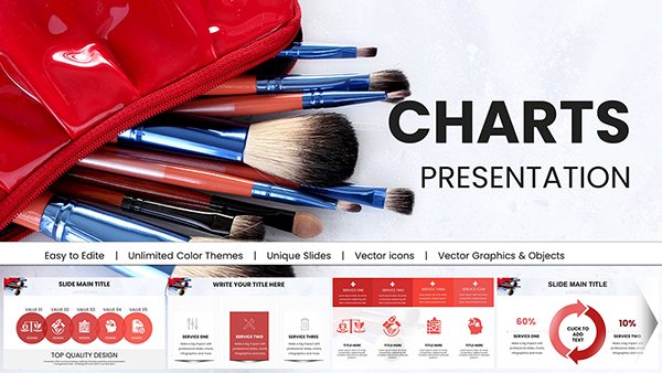
Unlock the power of circular Keynote charts designed for professionals. These templates simplify complex data into clear visuals ready-to-use for business reports education and marketing presentations.
From pie charts and radial diagrams to concentric rings these charts add modern flair to slides while maintaining clarity. Enhance your presentations with vibrant colors smooth animations and intuitive layouts that engage audiences effortlessly.
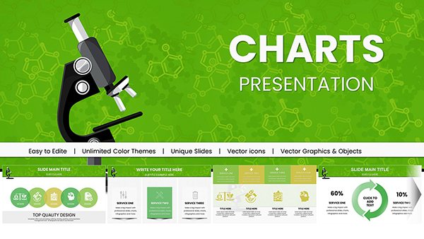
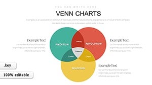
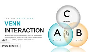
Science Technology Society Venn Keynote Template - 30 Slides
ID: #KC00863
$20.00
(1082)
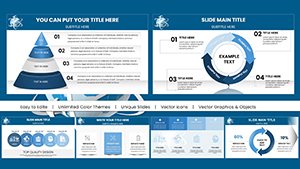
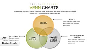
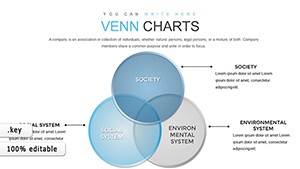
Venn Problem Solving Keynote Charts: Elevate Your Analysis Game
ID: #KC00862
$19.00
(859)
Gear Financial Risks Keynote Charts: Transform Data into Actionable Insights
ID: #KC00858
$16.00
(354)
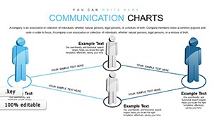
Communication Keynote Charts Template
ID: #KC00826
$16.00
(1096)
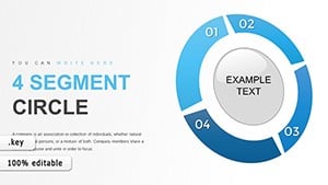
Segment Circle Keynote Charts Template: Unlock Consumer Insights
ID: #KC00821
$15.00
(107)
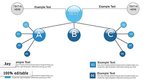
Organizations Work Keynote Charts: Streamline Coordination
ID: #KC00820
$15.00
(1013)
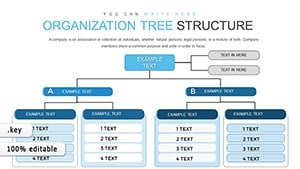
Organization Tree Keynote Charts: Visualize Hierarchies Effortlessly
ID: #KC00819
$16.00
Why Choose Circular Keynote Charts
Circular Keynote charts provide an elegant way to display cyclical data relationships distributions and progressions. Unlike standard templates our designs emphasize clarity aesthetics and readability.
Real-World Use Cases
Business Reports: Visualize KPIs sales funnels and budget allocations clearly.
Marketing Presentations: Showcase channel performance and customer journeys.
Educational Lessons: Illustrate life cycles processes or scientific concepts.
Benefits Over Default Templates
Editable and animated for dynamic storytelling.
Optimized for clarity with balanced segments and high-contrast colors.
Reduce slide prep time with pre-designed polished visuals.
Creative Tips and Best Practices
Limit segments to 6-8 for maximum readability.
Use rotations and layering for emphasis and depth.
Pair charts with concise legends or annotations off-slide.
Explore our collection now and download editable circular charts to transform your presentations into professional engaging experiences.
Frequently Asked Questions
Can I customize the colors and segments of the charts?
Yes all charts are fully editable allowing you to change colors segment sizes labels and animations to suit your presentation needs.
Are these charts suitable for educational purposes?
Absolutely they are ideal for illustrating cycles, processes, and layered data insights for teaching and learning scenarios.
Do these templates support animations in Keynote?
Yes they are optimized for smooth animations enabling progressive data reveals that engage your audience effectively.
Can I use these charts for marketing presentations?
Yes circular charts are perfect for marketing reports, campaign performance visuals, and strategic overviews.
How do these charts compare to default Keynote charts?
Our charts offer enhanced clarity, better animation, and editable features that save time and improve audience engagement.