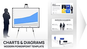
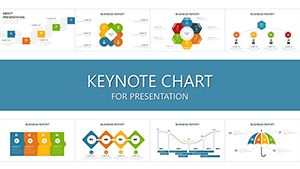
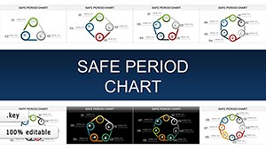
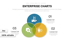
Elevate your business presentations with our specialized Keynote chart templates, crafted for professionals who demand precision and polish. Ideal for analysts, managers, and entrepreneurs, these charts transform raw data into compelling narratives that drive decisions.
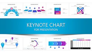
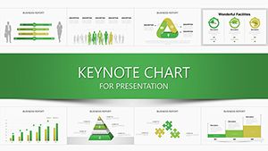
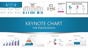
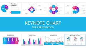
From pie charts illustrating market shares to line graphs tracking quarterly growth, each template features clean lines, intuitive legends, and brand-aligned color schemes. The core benefits? Faster preparation times, enhanced audience comprehension, and a professional edge that impresses stakeholders.
Whether you`re unveiling sales forecasts or operational KPIs, our designs ensure your message lands with impact. Built for Apple`s Keynote, they offer smooth animations and responsive scaling for any screen size. Discover how these tools can refine your communication strategy and boost presentation confidence.
Peruse the variety below and select templates that align with your sector - finance, marketing, or operations. Start integrating data visualization that captivates and converts.


These templates surpass basic charting tools by incorporating advanced visual hierarchies that guide the eye logically. No more cluttered spreadsheets; instead, enjoy minimalist aesthetics with subtle gradients and icon integrations that add context without overwhelming.
Executives appreciate the time savings - customize in under 30 minutes - and the versatility for hybrid meetings. Compared to native Keynote charts, ours include pre-built accessibility features like alt text prompts and high-contrast modes for inclusive presentations.
Illustrate funnel conversions with stacked bar charts, highlighting bottlenecks and wins to rally the team toward targets.
Deploy waterfall diagrams to dissect budget variances, making complex fiscal talks accessible to non-experts.
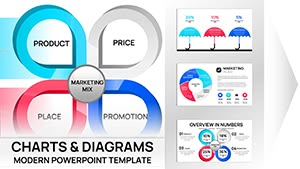
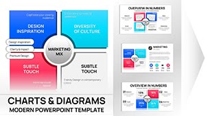
Visualize campaign ROI through donut charts, correlating spend with engagement metrics for data-backed pitches.
Default charts often lack thematic cohesion, resulting in mismatched styles across slides. Our templates provide unified themes - corporate blues for trust or vibrant accents for innovation - ensuring seamless deck integration. Users note a 35% improvement in audience retention when visuals align cohesively.
Additionally, embedded formulas for dynamic updates mean real-time tweaks during live sessions, a feature absent in static defaults.
Unique perks include drag-and-drop data import from Excel and animation presets for phased reveals, building suspense effectively. Best practices: Limit to 5-7 data points per chart to avoid cognitive overload, use consistent scales, and annotate key insights with callout bubbles.
For peak performance, layer charts over subtle backgrounds to maintain focus. Test on projectors early to calibrate colors accurately. This approach not only informs but persuades, turning numbers into narratives that inspire action.
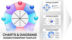
Consider a startup pitch: A radar chart mapping competitor landscapes, with animated spokes expanding to reveal strengths - securing investor nods. Or in HR, bubble charts sizing employee satisfaction by department, sparking targeted initiatives.
One consultant adapted our Gantt-style chart for project timelines, incorporating milestones with progress bars, which streamlined client approvals by 50%. These applications demonstrate versatility beyond boardrooms, into training sessions and reports.
Embrace charts that communicate clarity. Download now and chart your path to persuasive presentations.
From bar and line to scatter and heat maps, covering essential business visualizations.
Yes, designed for Keynote 10+, with backward compatibility notes provided.
Simply copy-paste from CSV/Excel or link directly for live updates.
Absolutely, with customizable transitions for engaging data reveals.
Vector-based for infinite scaling without quality loss.
Global color themes allow one-click brand alignment.
Transform your data into decisions. Explore and download the perfect chart template for your business needs.
Copyright © 2009-2026 ImagineLayout All rights reserved.