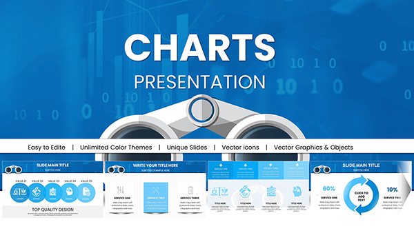
Bullet point charts in Keynote are designed for situations where clarity, prioritization, and structured messaging matter more than decoration. This category serves business professionals, consultants, trainers, and marketers who need to communicate structured information quickly and convincingly. Instead of relying on default text lists, these templates transform bullet points into visually balanced chart layouts that improve hierarchy, readability, and audience retention.
Use bullet point charts when presenting executive summaries, product features, strategic priorities, action plans, or structured comparisons. Compared to default Keynote text boxes, these layouts provide alignment precision, spacing consistency, icon integration, and visual grouping that elevate professional presentations.

Bullet point slides are often underestimated. In business settings, they carry critical information: board recommendations, quarterly highlights, compliance updates, project milestones, and strategic objectives. However, default Keynote bullet lists lack visual structure. They create dense text blocks that reduce engagement.
Bullet point charts solve this by introducing spatial logic. Instead of a vertical text column, information is grouped, segmented, and visually weighted. Icons, dividers, grid alignment, and contrast areas help audiences scan content quickly. In executive environments where time is limited, this clarity is essential.
Use bullet point charts when:
If your slide requires visual hierarchy and controlled emphasis, a bullet chart layout performs better than plain text.
Bullet point Keynote charts are versatile across professional sectors. Their value lies in transforming structured content into visually guided communication.
Summarize quarterly performance, investment priorities, or operational risks using clearly segmented bullet structures. The visual grouping prevents information overload while reinforcing priority order.
Consultants often present diagnostic findings, recommendations, and roadmap actions in bullet format. Chart-based bullet layouts improve authority by organizing insights into balanced visual zones.
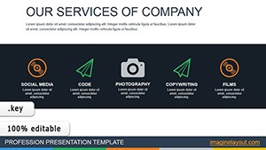
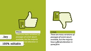
Feature comparisons, campaign pillars, positioning statements, and audience benefits are ideal for bullet visualization. Structured spacing increases persuasion and credibility.
In learning environments, structured bullet charts enhance comprehension. Learners absorb grouped content more efficiently than dense paragraphs.
Bullet point charts are focused on structured textual hierarchy. Unlike diagrams, they do not model processes or systems. Unlike timelines, they do not emphasize chronological progression. Instead, they highlight prioritized, grouped, or categorized information.
This category exists for presenters who need clarity without narrative sequencing or conceptual mapping. If your message is about listing, structuring, comparing, or summarizing — bullet charts are the correct visual choice.
Using built-in text placeholders may seem efficient, but professional presentations require more control. These templates provide:
The result is stronger audience focus and better message retention.
Avoid overloading slides. Three to five points per segment create optimal clarity.
Icons should reinforce meaning, not decorate. Match icons with functional categories such as risk, growth, cost, performance, or timeline.
Use contrast to emphasize the most important bullet. Executive audiences scan for priority cues.
When using bullet charts across multiple slides, keep alignment and spacing uniform to maintain a cohesive presentation system.
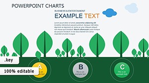
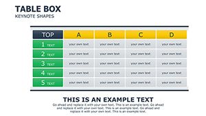
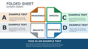
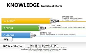
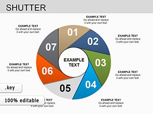
Within this category, you will find variations including side-by-side comparisons, segmented columns, numbered bullet structures, and icon-supported lists. Choose a layout based on whether your goal is comparison, prioritization, categorization, or summarization.
Well-designed bullet point charts make structured information persuasive. They help your audience focus on what matters and support confident decision-making.
Use bullet point charts when presenting structured lists, priorities, or categorized information. Diagrams are better for processes or relationships, while bullet charts focus on clarity and hierarchy.
Yes. Bullet chart layouts are particularly effective in executive briefings because they emphasize concise communication and visual structure.
All templates are fully editable in Keynote. You can adjust colors, typography, icons, and spacing to match your brand guidelines.
For optimal readability, limit each grouped section to three to five points. This keeps the slide focused and visually balanced.
Copyright © 2009-2026 ImagineLayout All rights reserved.