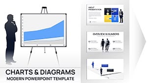
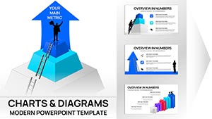
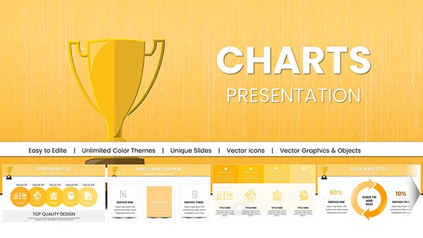
Simplify data presentation with our PowerPoint chart templates, designed to make numbers narrative and accessible. Perfect for conveying trends, comparisons, and forecasts with ease.
For data enthusiasts, executives, and consultants, these templates offer plug-and-play functionality with customizable elements like series colors and labels.
Explore options from waterfall charts for financial breakdowns to combo charts blending lines and bars for multifaceted views. Make every slide a data masterpiece.
Check out PowerPoint chart templates and enhance your analytics.
They surpass defaults with built-in sparklines for mini-trends and conditional formatting for outliers.
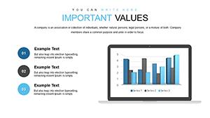
Research and Sales
Scientists plot experimental results in box-and-whisker formats, showing variability. Sales reps use sunburst charts to drill down territories hierarchically.
Guidelines: Align chart orientation with reading flow and use legends sparingly. Validate data sources pre-insertion.
Better Than Basic PowerPoint Charts
Basics demand heavy customization; ours provide themed variants and Excel integration for seamless updates. Boosts efficiency and visual appeal.
Highlights: High-DPI rendering and alt-text automation for inclusivity.
Pro Tips for Editing
Utilize chart tools for quick value edits.
Apply picture fills for branded series.
Duplicate slides for scenario modeling.
Success story: An e-commerce firm visualized cart abandonment with our template, optimizing checkout for 20% uplift.
Industry Innovations with Charts
HR uses pyramid charts for workforce demographics; logistics employs route-optimized Sankey diagrams. Designers stylize gauges for KPI dials.
Creative hack: Morph charts between states to show progress over time.
Pro advice: Balance detail with simplicity - aim for 3-5 data points max per chart.
Streamlining Chart Creation
Leverage Power BI links for live dashboards. Review with focus groups for interpretability.