Harness the power of visuals with our Keynote charts templates, engineered to distill complex data into digestible, attractive formats. Ideal for turning numbers into narratives that drive decisions.
Suited for analysts, managers, and educators, these templates feature scalable axes, intuitive legends, and animation options that reveal insights progressively.
From bar graphs tracking trends to pie charts showing distributions, each design prioritizes accuracy and aesthetics. Elevate your Keynote presentations from informative to influential.
View Keynote charts templates and start visualizing success.
Event Calendar Keynote Charts Template: Organize and Present Schedules Effortlessly
ID: #KC00737
$14.00
(26)
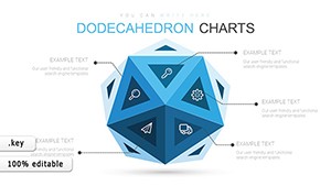
Dodecahedron Geometric Keynote Charts: Revolutionize Your Data Presentations
ID: #KC00691
$13.00
(490)
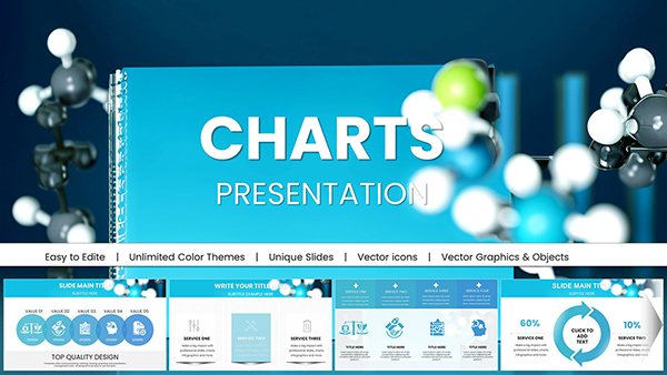
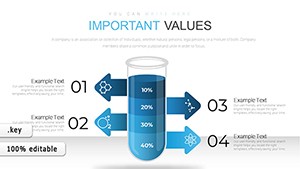
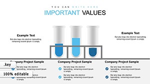
Lab Glassware Keynote Charts Template for Science
ID: #KC00671
$15.00
(1173)
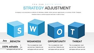
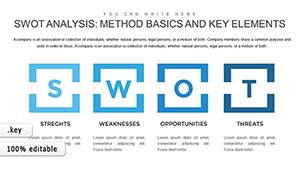
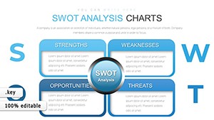
SWOT Keynote Charts: Unlock Strategic Insights with Editable Infographics
ID: #KC00653
$18.00
(255)
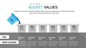
Bucket Creative Keynote Charts: Infuse Originality into Your Infographics
ID: #KC00634
free
(318)
Modern Professional Keynote Charts Template: Mapping Connections
ID: #KC00618
$12.00
(691)
Editable Calendar Keynote Templates: Chart Your Path Forward
ID: #KC00617
$9.00
(116)
Free Chemical Test Keynote Charts Template
ID: #KC00613
free
Practical Applications of Keynote Charts
Charts templates transform raw data into strategic assets. Finance teams plot revenue forecasts with line charts, highlighting growth curves clearly.
Business Analytics
Performance Dashboards: Aggregate KPIs in multi-series bar charts for executive overviews.
Market Analysis: Use scatter plots to correlate variables like price and demand.
Budget Allocations: Donut charts break down expenses visually.
Beyond basics, ours support trend lines and error bars, offering precision standard Keynote lacks.
Academic and Research Uses
Researchers illustrate survey results with stacked columns, layering demographics for depth. Instructors animate histogram builds to teach probability distributions interactively.
Best practices: Choose chart types matching data nature - linear for time series - and label axes descriptively. Calibrate scales to avoid distortion.
Edge Over Native Keynote Charts
Native tools require manual styling; our templates arrive pre-formatted with gridlines and tooltips for hover details. This accelerates setup while enhancing professionalism.
Value adds: Responsive to data imports from Numbers and color-blind friendly palettes.
Advanced Customization
Link to external spreadsheets for real-time updates.
Apply 3D rotations sparingly for emphasis.
Group with shapes for hybrid visuals.
Case study: A startup`s funding pitch featured our radar chart for competitive positioning, clinching investment.
Cross-Industry Chart Innovations
Environmental reports use area charts for cumulative impacts, while retail employs heat maps for sales density. Creatives stylize bubble charts for mood boards, sizing by relevance.
Experiment: Overlay multiple chart types on one slide for comparative analysis, using transparency for overlaps.
Insight: Animate data points sequentially to guide narrative flow.
Enhancing Chart Effectiveness
Pair with annotations for context and test on various displays for color fidelity. Gather feedback on clarity to iterate designs.
Ready for data excellence? Grab Keynote charts templates now.