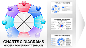
Harness the power of Bowman`s Strategy Clock in PowerPoint with our expert-crafted charts. This classic model dissects eight strategic routes, balancing price and perceived added value to reveal optimal paths. Our templates streamline this process, delivering polished visuals that clarify complex positioning for your audience.
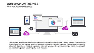
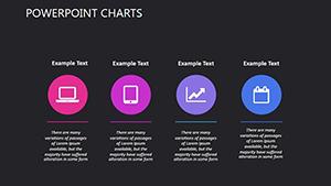
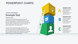
Aimed at business analysts, product managers, and strategy teams, these charts integrate effortlessly into PowerPoint decks. With vibrant, resizable components and smart art compatibility, they adapt to your narrative while maintaining professional polish. From hybrid strategies to niche focus, visualize your roadmap with confidence.
Suited for sales reviews, innovation brainstorms, or board updates, they spark insightful dialogues. Peruse our selection of Bowman`s Strategy Clock PowerPoint charts and equip yourself with tools that drive strategic clarity and success.

Bowman`s Strategy Clock thrives in dynamic business contexts. E-commerce leaders plot product lines on the clock during quarterly reviews, spotting opportunities like shifting to differentiation for premium lines. One e-retailer credited our chart with a 20% revenue uplift after realigning low-price offerings.
In corporate training, HR pros use it to frame career development paths, mapping employee value against compensation. Venture capitalists incorporate these visuals in pitch decks, demonstrating startup positioning against incumbents for investor buy-in.
Default PowerPoint shapes often result in clunky, non-proportional clocks that distort analyses. Our templates counter this with precise geometry and auto-adjusting axes, preserving model integrity. While basic versions lack interactivity, ours embed hyperlinks and morph transitions for immersive experiences.
Superior color psychology - using warms for high-value zones - enhances persuasion, outperforming bland defaults that fail to evoke strategy urgency.
Import your dataset via Excel links for real-time updates, then apply theme-consistent fonts. Animate wedges to unfold clockwise, mirroring the model`s flow, and export to video for stakeholder shares.
Enhance by fusing the clock with funnel diagrams for conversion path analysis, or use in dashboards linking to live metrics. A consulting firm animated competitor migrations on the clock, captivating clients during strategy overhauls. For startups, pair with canvas models to build holistic business plans.
Adapt for seasonal campaigns by versioning clocks per quarter, tracking shifts in consumer perceptions.
Secure your Bowman`s Strategy Clock PowerPoint charts now and elevate your strategic toolkit with proven designs.
These FAQs clarify key aspects - grab your template and apply strategic precision immediately.
Copyright © 2009-2026 ImagineLayout All rights reserved.