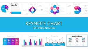
Illuminate your data narratives with Keynote chart templates that leverage Apple`s sleek rendering for unmatched visual appeal. Crafted for strategists, analysts, and presenters on macOS who value precision and polish.
From animated bars to interactive pies, these designs integrate seamlessly with Keynote`s tools, supporting live data from Numbers and fluid animations. Focus on insights, not formatting, with pre-configured legends and tooltips.
Aimed at creative agencies and tech innovators, they deliver charts that adapt to themes and export flawlessly to video or PDF.
Explore our Keynote charts and plot your data destiny!
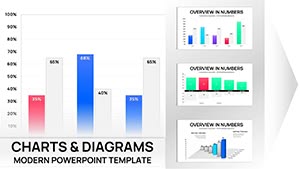
Medical Charts Keynote Template - Editable Healthcare Infographics
ID: #KC01045
$20.00
(14)
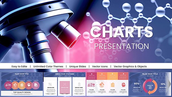
Microbiology Keynote Charts Template
ID: #KC01044
$22.00
(791)
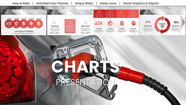
Oil Price Keynote Charts: Forecast Energy Markets
ID: #KC00999
$18.00
(522)
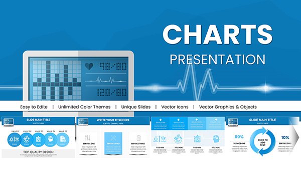
Design Automatic Tonometer Keynote Charts Template: Illuminate Eye Health Data
ID: #KC00978
$18.00
(445)
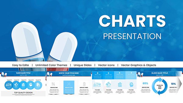
Pill Pharmaceutical Medical Keynote Charts Template: Master Drug Data Storytelling
ID: #KC00977
$18.00
(922)
Geothermal Energy Charts for Keynote: Illuminate Renewable Insights
ID: #KC00969
$20.00
(1026)
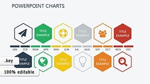
Education-Focused Keynote Charts Pack: Spark Learning with Visuals
ID: #KC00968
$20.00
(1181)
Project Timeline Keynote Charts Template - Plan & Present
ID: #KC00942
$25.00
(686)
Performance Appraisal Keynote chart Presentation
ID: #KC00921
$20.00
(740)
Remote Work Keynote Charts: Virtual Team Insights
ID: #KC00892
$18.00
(498)
Drive Awareness with Preventing Sexual Violence Keynote Template
ID: #KC00879
$15.00
(485)
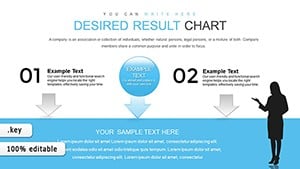
Desired Result Keynote Charts for Marketing Research
ID: #KC00867
$17.00
(1071)
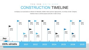
Construction Timeline Keynote Charts - 42 Editable Slides
ID: #KC00864
$18.00
(721)
Oil Report Keynote Charts: Mastering Global Market Insights
ID: #KC00792
$17.00
(80)
Keynote Process Charts - Fully Editable | ImagineLayout
ID: #KC00716
$22.00
(568)
Keynote Business Graphics Template - Instant Download | ImagineLayout
ID: #KC00712
$22.00
(821)
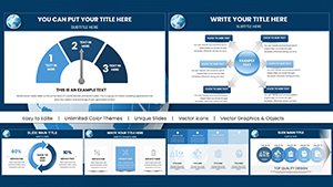
Analysis & Planning Keynote Charts: Chart Your Path to Strategic Brilliance
ID: #KC00593
$18.00
(834)
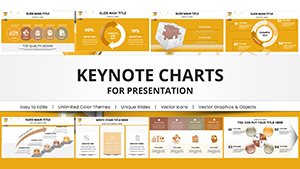
Development Keynote Charts Template: Empower Your Project Narratives
ID: #KC00530
$23.00
(406)
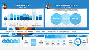
Partnership Organizational Keynote Pie Charts Template
ID: #KC00527
$23.00
(493)
Animated Product Dev Charts for Keynote
ID: #KC00447
$18.00
(615)
Boost Sales: SEO Services Keynote Charts Template
ID: #KC00408
$15.00
(449)
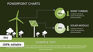
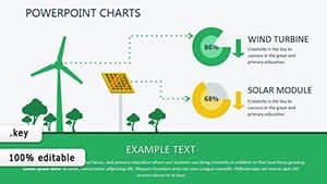
Renewable Energy Keynote Charts: Harnessing Data for a Greener Tomorrow
ID: #KC00399
$16.00
(719)
Fully Editable Renewable Energy Charts Keynote Template - Instant Download
ID: #KC00398
$16.00
Superior Charting in Keynote
Keynote elevates charts beyond static images with 3D rotations and build paths - our templates harness this for immersive experiences. They outpace defaults with thematic overlays, like oceanic blues for market waves.
Strategists chart SWOT matrices, analysts plot regression lines, and designers visualize user flows with curved connectors.
Core Use Cases
Investor Updates: Candlestick simulations for financial health.
Design Feedback: Bubble charts for feature prioritization.
Performance Reviews: Radar webs for skill assessments.
Trend Forecasting: Area fills for growth projections.
Dynamic linking to spreadsheets ensures updates propagate instantly, a boon over manual entries.
Refining Charts in Keynote
Tweak series colors via the inspector, sequence reveals with magic move, and embed charts in master slides for consistency.
A VC firm wowed backers with our animated growth chart, securing funding through compelling trajectories.
Pro Charting Hacks
Utilize shadows for depth without overload.
Sync with iOS for mobile tweaks.
Record narrations over chart evolutions.
Compress files for swift shares.
Chart with confidence - download a Keynote chart template and shine.
Chart-Driven Victories
Lee`s agency used polar charts for campaign ROI, clinching renewals. Kara`s research visualized correlations, publishing in top journals.
Spanning from health metrics to sales dashboards, impact is universal.
Seamless Setup
Import CSV for quick populates, preview in full screen, and integrate with Final Cut for hybrids. Optimized for M1 chips and beyond.
Frequently Asked Questions
Do charts support 3D effects?
Yes, rotatable 3D views add dimension to your data.
Can I import from Numbers?
Directly - copy-paste or link for live syncing.
Are animations customizable?
Fully - adjust timing, paths, and triggers per element.
What export options exist?
PDF, video, or images with retained interactivity where possible.
Data deserves drama - claim your Keynote chart template.