Bank Keynote charts are designed for financial institutions, investment teams, consultants, and corporate finance departments that require precision, credibility, and structured data storytelling. These templates help transform complex financial figures into clear, board-ready visuals. Instead of relying on default shapes or generic graphs, banking chart slides provide structured layouts tailored to capital flows, asset allocation, credit risk analysis, loan portfolio performance, and regulatory reporting. They are ideal for quarterly reviews, investor briefings, strategic planning sessions, and financial modeling presentations where clarity and authority are essential.


Financial presentations differ from general business decks. In banking environments, data must be accurate, structured, and immediately interpretable. Bank Keynote chart templates are created specifically for financial metrics such as net interest margin, capital adequacy ratios, liquidity trends, asset growth, and portfolio diversification.
Unlike default Keynote chart tools, these layouts are pre-structured to reflect real financial reporting logic. Categories, labels, comparative timelines, and segmented visual blocks are arranged to mirror how analysts and executives review performance.
Standard charts are useful for general trends. However, banking presentations require contextual framing. Use bank-specific chart templates when presenting:
These templates provide visual hierarchy that aligns with financial decision-making processes.
Banking audiences include board members, regulators, investors, and senior management. Slides must communicate reliability and professionalism. Bank Keynote charts emphasize structured grids, aligned data blocks, balanced typography, and disciplined color schemes that support credibility.
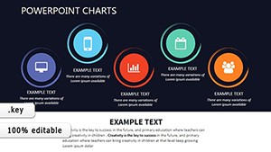
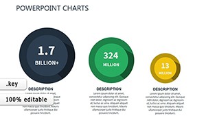
Instead of decorative elements, these templates focus on clean financial storytelling. Data stands at the center. The layout supports insight extraction rather than visual distraction.
In board meetings, time is limited. Executives need immediate answers to questions such as:
Well-designed banking charts make these answers visible at a glance. Structured comparison columns and layered data visualization eliminate the need for lengthy explanation.
Financial storytelling is not about decoration. It is about structuring numbers into a decision narrative. Bank Keynote charts help presenters move logically from macro trends to detailed breakdowns. For example:
This structured approach improves comprehension and confidence in the presented data.
Default chart tools require manual formatting and alignment adjustments. Banking templates provide:
This reduces preparation time and ensures presentation consistency across departments.
These templates are valuable for:
Consultants working with financial institutions benefit from structured chart systems that align with industry reporting standards.
Regulatory reporting demands clarity and transparency. Bank Keynote charts can structure capital adequacy metrics, stress testing scenarios, liquidity coverage ratios, and credit exposure summaries into digestible visual frameworks.
Instead of overwhelming audiences with spreadsheets, presenters can display summarized financial dashboards that maintain analytical depth.
General business chart templates focus on marketing performance, operational metrics, or project analytics. Bank Keynote charts are specifically structured for financial architecture. The difference lies in:
This specialization ensures alignment with banking standards and professional expectations.
Clear financial slides build credibility and accelerate executive decision-making.
Yes. They are structured specifically for financial performance reviews, including revenue trends, profit margins, capital ratios, and portfolio analysis.
All charts are fully editable in Keynote. You can adjust data values, labels, currency formats, and timeframes to match your reporting requirements.
Yes. Fintech startups can use these structured financial visuals to communicate growth metrics, funding allocation, and performance trends to investors.
They are designed specifically for banking data structures, focusing on ratios, capital flows, portfolio segmentation, and regulatory reporting instead of general business metrics.
Copyright © 2009-2026 ImagineLayout All rights reserved.