Transform raw bank account data into insightful visuals using our PowerPoint chart templates. Ideal for financial analysts, accountants, and business leaders, these templates feature advanced charting tools to illustrate transaction flows, balance histories, and forecast projections. Say goodbye to bland spreadsheets and hello to engaging slides that capture attention in boardrooms or client meetings.
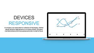
Our designs incorporate bar graphs for fee comparisons, line charts for growth trends, and donut visuals for asset allocation - all fully editable in Microsoft PowerPoint. With drag-and-drop elements and theme consistency, you can focus on analysis rather than aesthetics. These templates are a game-changer for quarterly reviews or investment strategy sessions.
Dive into our collection and discover how precise charting can clarify complex financial stories. Customize and present with confidence - your data deserves to shine.

Charts are the backbone of effective bank account presentations, turning numbers into narratives. Our PowerPoint templates specialize in this, offering use cases across sectors like retail banking, wealth management, and fintech startups. For example, loan officers can use waterfall charts to break down repayment schedules, while CFOs might opt for scatter plots to correlate account activity with market shifts.
Versus default PowerPoint charts, ours come pre-formatted with financial color palettes (e.g., reds for deficits, blues for assets) and labeled axes tailored to banking jargon like "APR" and "Equity." This reduces setup time by up to 70%, allowing deeper dives into interpretations.
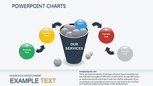
Select chart types based on data complexity: pie for proportions, Gantt for timelines. Apply subtle gradients for depth without overwhelming. For interactivity, embed hyperlinks to detailed ledgers, guiding viewers through layers of info.
A standout application: Create a "Account Health Dashboard" slide with KPI gauges, instantly signaling risks or opportunities to stakeholders.
What sets our templates apart is their scalability - from solo freelancers to enterprise teams. Built with accessibility in mind, they include alt text suggestions for charts and high-contrast modes. Finance educators praise their clarity for classroom demos on budgeting.
Integrate with Power BI for real-time data feeds, making your presentations live and responsive. Download now to see how these charts can pivot a skeptical audience into enthusiastic supporters.
Remember to annotate key data points with callouts for emphasis, ensuring no insight gets lost.
Empower your analyses with visuals that speak volumes. Select a template and chart your path to clearer financial communications.
Copyright © 2009-2026 ImagineLayout All rights reserved.