Balls PowerPoint Charts

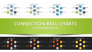
Bring your data to life with Balls PowerPoint Charts, where spherical visuals bounce with meaning. This collection specializes in vector-based graphics that represent tasks, durations, and relationships in a playful yet precise manner, perfect for project managers, analysts, and educators.

Sizes denote magnitudes, connections illustrate flows, and colors categorize effortlessly. Unlike flat bar graphs, these charts add depth and motion, making complex datasets accessible and intriguing. Tailored for PowerPoint, they integrate smoothly with your existing slides.

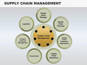
From supply chain mappings to market share breakdowns, these templates turn numbers into narratives. Customizable to fit any palette or scale, they ensure your presentations roll smoothly. Explore the variety and select charts that propel your message forward - download and deploy with confidence.


View by: Last Added | Most Popular
  • like 2
    (994)
    Wedding PowerPoint Charts - Customizable Wedding Presentation Templates
    ID: #PC01055
    $22.00
  • like 5
    (369)
    CRM System PowerPoint Charts Template - Elevate Your Data Storytelling
    ID: #PC00860
    $18.00
  • like 4
    (62)
    Ball Pendulum PowerPoint Charts Template
    ID: #PC00705
    $15.00
  • like 4
    (385)
    Analytical Accounting PowerPoint Charts: Elevate Financial Narratives
    ID: #PC00609
    $19.00
  • like 5
    (538)
    Analytical Tool PowerPoint Charts Template: Elevate Your Data Presentations
    ID: #PC00597
    $15.00
  • like 2
    (184)
    Choice and Advantages PowerPoint Charts: Master Decision Visuals
    ID: #PC00563
    $18.00
  • like 2
    (49)
    Online Stores PowerPoint Templates for Dynamic Presentations
    ID: #PC00556
    $20.00
  • like 4
    (644)
    Analytical Skills PowerPoint Charts Template: Master Data with Precision
    ID: #PC00537
    $19.00
  • like 4
    (797)
    Relationships Charts Template for Architectural Collaborations
    ID: #PC00516
    $17.29
  • like 3
    (624)
    Competitiveness PowerPoint Charts Template: PPTX
    ID: #PC00510
    $18.00
  • like 2
    (162)
    Target Online PowerPoint Charts Template: Visualize Goals with Precision
    ID: #PC00412
    $20.00
  • like 5
    (645)
    Map Studying PowerPoint Template: Editable Charts for Geographical Insights
    ID: #PC00367
    $18.00
  • like 3
    (167)
    Analysis Choice PowerPoint Template: Customizable Data Visualization Charts
    ID: #PC00365
    $14.00
  • like 5
    (131)
    Criteria and Metrics PowerPoint Charts: Measure Your Architectural Mastery
    ID: #PC00354
    $19.00
  • like 4
    (831)
    Analytical Reviews PowerPoint Charts Template
    ID: #PC00349
    $17.00
  • like 4
    (1042)
    Hierarchy of Needs PowerPoint Charts - Download Diagrams Template
    ID: #PC00344
    $17.00
  • like 4
    (1173)
    Analysis Sphere PowerPoint Charts Template
    ID: #PC00194
    $20.00
  • like 2
    (265)
    Supply Chain Management PowerPoint Charts for Strategic Presentations
    ID: #PC00129
    $17.00
  • like 2
    (99)
    Billiards PowerPoint Charts Template
    ID: #PC00087
    $18.00
  • like 2
    (437)
    Connected Balls PowerPoint Charts Template - 25 Editable Slides
    ID: #PC00014
    $16.00
  • like 4
    (395)
    Cyclical Balls PowerPoint Charts Template - Visualize Data
    ID: #PC00012
    $16.00


The Power of Spherical Data Displays in PowerPoint

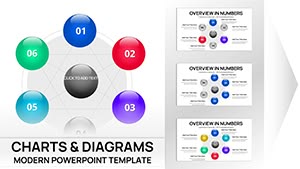
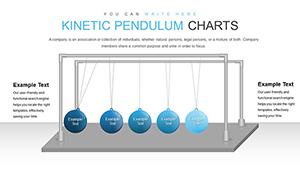
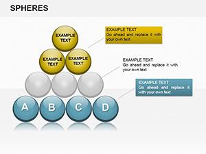
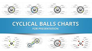
Balls PowerPoint Charts revolutionize how you visualize information, using rounded forms to symbolize interconnected elements. Standard charts often feel rigid, but these introduce fluidity, helping audiences grasp sequences and scopes at a glance.

In business settings, they`re invaluable for depicting workflow dynamics or competitive landscapes, where ball clusters highlight bottlenecks or synergies. The kinetic appeal fosters better comprehension, ideal for stakeholder updates or training modules.

Industry-Specific Applications

  • Project Management: Sequence tasks as chained balls to monitor timelines and dependencies.
  • Marketing Analytics: Size spheres by engagement metrics for vivid campaign overviews.
  • Educational Content: Illustrate scientific models like atomic structures with interactive ball arrays.
  • Financial Reporting: Represent portfolio diversifications through color-grouped orbs.

These outperform linear visuals by enhancing spatial awareness, with studies showing 30% faster insight extraction.

Maximizing Value with Balls Charts

Key strengths include scalability and editability - resize without distortion and link to live data for real-time updates. Best practices: Limit clusters to 10-15 balls for clarity, use transparency for overlaps, and animate paths to reveal evolutions.

Creatively, embed these in dashboards for holistic views or layer with photos for product lifecycle stories. Enhance your toolkit now - download a chart pack and streamline your analytics.

Expert Implementation Guide

  1. Calibrate sizes proportionally to avoid misleading scales.
  2. Employ dashed lines for tentative connections in brainstorming slides.
  3. Pair with legends styled as rolling balls for intuitive keying.
  4. Optimize for mobile by simplifying to core clusters.

Such approaches ensure charts not only inform but also delight, driving informed decisions.

Frequently Asked Questions

How do balls charts differ from bubble charts? They emphasize connections and motion over pure size, adding relational depth for dynamic stories.

Are they compatible with Excel data? Yes, import via paste special for automatic updates.

Best animation techniques? Sequential bounces to build narratives progressively.

Handling large datasets? Group into sub-clusters with zoom features for detail dives.

File compatibility? PPTX format works across versions 2016+.

Customization time? Under 10 minutes for basic tweaks.