Master data storytelling with our specialized PowerPoint chart templates, engineered for precision and persuasion. Aimed at analysts, managers, and presenters, these tools convert raw numbers into compelling narratives through varied chart types like bars, pies, and lines.
Perfect for quarterly reviews, market analyses, or performance dashboards, each template minimizes distortion while maximizing readability. With built-in legends, tooltips, and color gradients, they facilitate quick interpretations and informed discussions.
Streamline your workflow by dragging data into pre-formatted visuals, freeing focus for strategic insights. Our designs adapt to themes, ensuring brand-aligned reports that resonate.
Peruse the range and select charts that amplify your data`s voice today.
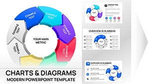
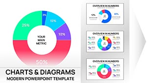
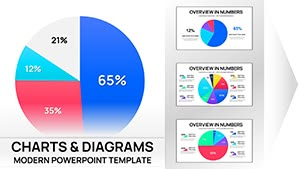
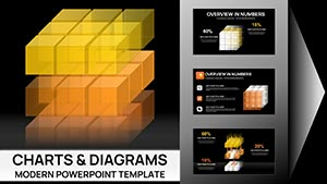
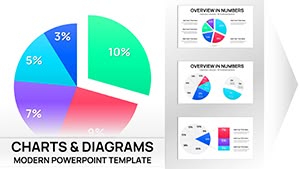
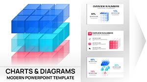
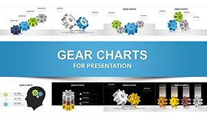
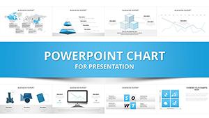
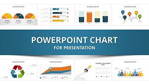
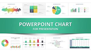
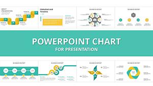


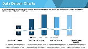


Chart templates are vital for data-heavy contexts. In finance, waterfall charts dissect profit variances, pinpointing revenue drivers. Marketing uses funnel visuals to track conversion paths, identifying drop-off points for optimization.
HR leverages radar charts for skill gap analyses, comparing team competencies holistically. E-commerce reports employ scatter plots to correlate sales with ad spends, revealing ROI patterns.
PowerPoint`s native charts lack aesthetic finesse, often defaulting to bland palettes that dilute impact; ours provide designer-approved schemes for instant appeal. Defaults demand manual data linking; our smart tables auto-update visuals on edits.
Enhanced accessibility features like alt-text prompts go beyond basics, aiding inclusive presentations.
Match type to message: comparatives suit bars, proportions pies. Scale axes uniformly to avoid skewing perceptions. Annotate outliers with callouts for context.
A retail analyst used our combo chart to overlay sales and inventory, optimizing stock levels. A non-profit visualized impact metrics via donut charts, boosting grant approvals. Tech leads tracked sprint velocities with burndown lines, refining agile processes.
Integrate sparklines for micro-trends within text slides. For dashboards, multi-chart collages offer at-a-glance overviews.
Employ consistent units, labeling clearly. Animate series entry for layered reveals. Validate with peer reviews for accuracy.
Explore options and download to illuminate your analytics. Make numbers narrate success stories.
Copyright © 2009-2026 ImagineLayout All rights reserved.