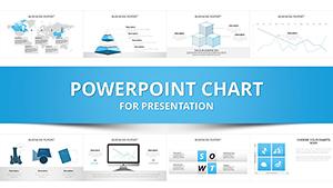
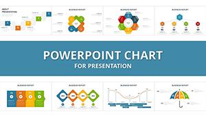
Audit presentations demand precision and clarity. Our collection of over 100 auditing chart templates for PowerPoint helps professionals present complex financial data, risk findings, and compliance metrics with confidence and visual impact.
These ready-to-use, animated designs include bar charts for comparisons, waterfall charts for variances, pie charts for allocations, and specialized diagrams for control assessments. Fully customizable and updated for 2026 standards, they save hours of design work while delivering polished results.
Whether preparing for board meetings, regulatory reviews, or internal reports, these templates ensure your message stands out and drives better understanding.
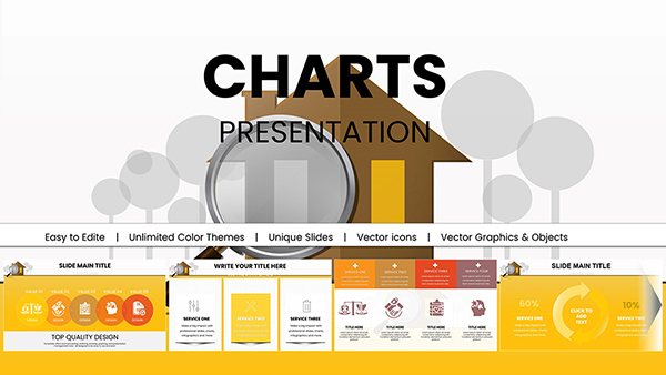
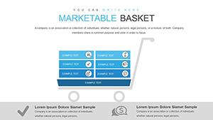
Marketable Basket PowerPoint Charts Template for Professional Presentations
ID: #PC00853
$20.00
(423)
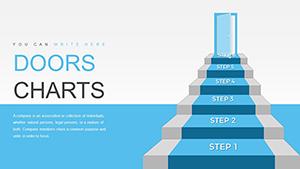
Doordash Customer Service PowerPoint Charts Template
ID: #PC00852
$17.00
(244)
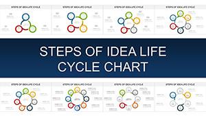
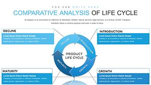
Comparative Analysis of Life Cycle PowerPoint Charts Template
ID: #PC00832
$15.00
(188)
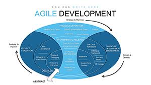
Agile Methodology PowerPoint Charts Template
ID: #PC00831
$13.00
(1150)
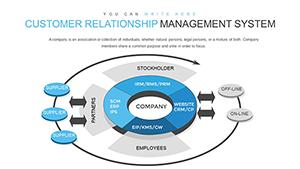
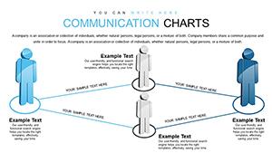
Communication PowerPoint Charts Template: Bridging Ideas in Architecture
ID: #PC00826
$16.00
Why Choose Specialized Auditing Chart Templates?
Default PowerPoint charts often feel generic and static. Our templates offer modern aesthetics, smooth animations, and layouts crafted specifically for auditing contexts, making data more engaging and easier to interpret.
Key advantages include time savings, enhanced credibility, and the ability to highlight critical findings at a glance.
Real-World Benefits Over Basic Charts
Professionally designed templates help auditors communicate insights more persuasively, leading to faster decisions and stronger stakeholder trust.
Practical Use Cases for Auditing Charts
These templates excel in:
Annual financial audit reports to executives and shareholders
Internal control reviews and management briefings
Regulatory compliance presentations and filings
Risk assessment dashboards for leadership teams
Training sessions on audit methodologies
For example, a waterfall chart can clearly explain budget variances, while a radar chart effectively compares control effectiveness across departments.
Creative Tips and Best Practices
Maximize impact with these approaches:
Use consistent color coding for compliant vs. high-risk items
Animate data entry to guide audience attention step-by-step
Limit each chart to 5-7 data points for clarity
Pair charts with brief explanatory text
Test readability on different screen sizes
Browse our auditing chart collection and download your first template free today!
Common Chart Types for Audits
Our library includes waterfall charts for financial flows, heat maps for risk concentration, bar charts for performance benchmarking, and more - all tailored to auditing needs.
These ready-to-use options help turn raw data into compelling stories.
Frequently Asked Questions
Are these auditing chart templates free to download?
Yes, many are completely free, with premium options offering additional designs and features.
Can I fully customize the charts?
Absolutely - change data, colors, labels, fonts, and layouts directly in PowerPoint.
Do the templates include animations?
Most modern designs feature built-in animations for dynamic data reveals.
What types of charts are best for auditing?
Waterfall, bar, pie, radar, and heat maps are particularly effective for audit data.
How many templates are available?
Over 100 unique auditing-focused designs, with regular updates.