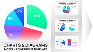
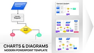
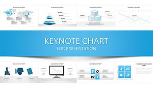
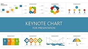
Transform your presentations with dynamic Keynote chart templates that elevate data visualization and storytelling.
Our collection includes over 50 ready-to-use designs perfect for business analytics educational lectures marketing strategies and more. Each template is fully editable allowing you to quickly customize colors fonts and data for impactful visuals.
Communication Process Chart Keynote Template - Editable Messaging Flow Diagrams
ID: #KC00935
$20.00
(431)
Propel Finance Keynote Charts: Growth Drives
ID: #KC00920
$20.00
(630)
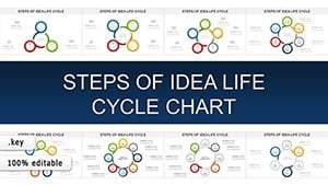
Idea Life Cycle Keynote Charts: From Brainstorm to Breakthrough in Every Slide
ID: #KC00906
$18.00
(465)
Network Solutions Keynote Charts: IT Data Mastery
ID: #KC00891
$18.00
(1096)
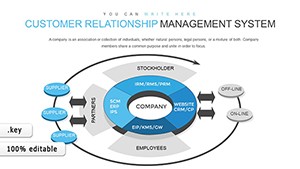
Customer Relationship Management Keynote Charts: Revolutionize Your Strategy
ID: #KC00860
$18.00
(495)
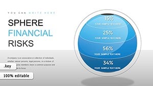
Sphere Financial Risks Keynote Charts: Safeguard Your Future
ID: #KC00859
$17.00
(769)
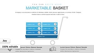
Marketable Basket Matrix Keynote Template for Economic Analysts
ID: #KC00853
$20.00
(528)
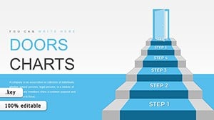
Step-by-Step 3D Stairs Keynote Charts Template
ID: #KC00852
$17.00
(386)
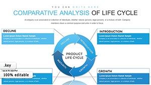
Life Cycle Analysis Keynote Charts for Managers
ID: #KC00832
$15.00
(840)
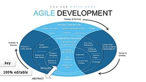
Agile Methodology Keynote Charts: 45 Slides
ID: #KC00831
$13.00
(354)
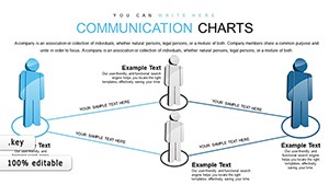
Communication Keynote Charts Template
ID: #KC00826
$16.00
(354)
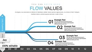
Dynamic Flow Data Analysis in Keynote Presentations
ID: #KC00822
$13.00
(818)
Houses for Sale and Rent Keynote Charts: Transform Your Real Estate Presentations
ID: #KC00753
$24.00
(535)
IT Processes Charts - Editable Keynote | ImagineLayout
ID: #KC00738
$19.00
(601)
Accumulation Keynote Charts - Capital Growth | Editable Keynote
ID: #KC00721
$15.00
(872)
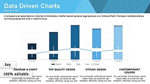
Data Driven Charts Keynote Template - Instant Download | ImagineLayout
ID: #KC00637
free
Why Choose Our Keynote Charts
Standard charts can feel flat and uninspiring. Our Keynote templates offer professional layouts animations and color schemes that make your data engaging and clear.
Real-World Use Cases
Business Reports: KPI dashboards and board meeting presentations.
Education: Simplified charts with annotation layers for lectures.
Marketing: Infographic-style charts for campaigns and social shares.
Financial Analysis: Waterfall and Gantt charts for projections.
Benefits vs Default Templates
Unlike default charts our templates save hours on formatting offer thematic consistency across slides and include pre-set animations to guide your audience.
Creative Tips & Best Practices
Limit 5-7 data points per chart for clarity.
Use stacked bars for compositions and sequential animations for storytelling.
Integrate custom icons or subtle 3D effects for emphasis.
Combine multiple templates to build comprehensive decks effortlessly. Download now and enhance every presentation.
FAQs
What chart types are included?
Bar line pie scatter radar and more all fully editable and animatable.
Are templates compatible with older Keynote versions?
Yes they work with Keynote 2016 and later with core features backward-compatible.
Can I import my own data?
Yes copy-paste or link Excel data directly into the templates for live updates.
Can I customize colors and fonts?
Yes all elements are fully editable to match your branding and style.
Do templates support animations?
Yes pre-set entrances and emphasis animations are included and fully editable.